
使用 CSS 根据屏幕尺寸更改列宽
cssweb developmentfront end technology更新于 2025/12/16 9:48:17
要根据屏幕尺寸更改列宽,代码如下 −
示例
<!DOCTYPE html>
<html>
<head>
<style>
body {
   font-family: "Segoe UI", Tahoma, Geneva, Verdana, sans-serif;
}
.sample {
   width: 50%;
   background-color: lightblue;
   height: 200px;
   font-size: 18px;
}
@media only screen and (max-width: 700px) {
   body {
      margin: 0;
      padding: 0;
   }
   .sample {
      width: 100%;
   }
}
</style>
</head>
<body>
<h1>Changing column width based on screen size</h1>
<div class="sample">Lorem ipsum dolor, sit amet consectetur adipisicing elit. Quod, maiores!</div>
<h3>Resize the browser window to 700px and below to see the above div width change to 100%</h3>
</body>
</html>
输出
上述代码将产生以下输出 −
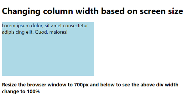
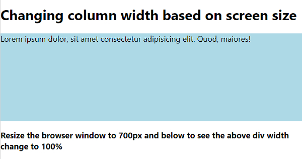
将浏览器窗口大小调整为 700 像素 −
相关文章
有用资源
css 参考教程 - 该教程包含有关 css 的更多信息:https://www.cainiaomax.com/css/

