
CSS 中心对齐、水平对齐和垂直对齐
cssweb developmentfront end technology更新于 2025/1/18 1:16:17
我们可以使用 CSS 对齐元素或其内部内容,CSS 提供了多种对齐选项,用于水平、垂直或居中对齐元素及其内容。
水平对齐
- 内联元素
内联元素或内联块元素(例如文本、锚点、跨度等)可以借助 CSS text-align 属性进行水平对齐。
- 块级元素
块级元素(例如 div、p 等)可以借助 CSS margin 属性进行水平对齐,但元素的宽度不应相对于父元素为 100%,因为这样就不需要对齐了。
- 使用浮动或定位方案的块级元素
元素可以借助CSS float 属性,可将多个元素左/右对齐,而不是居中对齐或使用 CSS 定位方案绝对方法。
示例
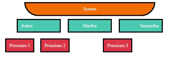
让我们看一个 CSS 水平对齐的示例 −
<!DOCTYPE html>
<html>
<head>
<title>CSS Horizontal Alignment</title>
<style>
.screen {
   padding: 10px;
   width: 70%;
   margin: 0 auto;
   background-color: #f06d06;
   text-align: center;
   color: white;
   border-radius: 0 0 50px 50px;
   border: 4px solid #000;
}
.seats span, .backSeats div{
   margin: 10px;
   padding: 10px;
   color: white;
   border: 4px solid #000;
}
.seats span{
   width: 120px;
   display: inline-block;
   background-color: #48C9B0;
}
.left{
   text-align: left;
}
.right{
   text-align: right;
}
.center{
   text-align: center;
}
.seats{
   text-align: center;
}
.backSeats div {
   background-color: #dc3545;
}
.leftFloat{
   float: left;
}
.rightAbsolute{
   position: absolute;
   right: 150px;
}
</style>
</head>
<body>
<div class="screen">Screen</div>
<div class="seats">
<span class="left">Adam</span>
<span class="center">Martha</span>
<span class="right">Samantha</span>
<div class="backSeats">
<div class="leftFloat">Premium 1</div>
<div class="leftFloat">Premium 2</div>
<div class="rightAbsolute">Premium 3</div>
</div>
</div>
</body>
</html>
输出
这将产生以下输出 −
垂直对齐
- 行内元素
行内元素或行内块元素(例如文本、锚点等)可以借助 CSS padding、CSS line-height 或 CSS Vertical-align 属性进行垂直对齐。
- 块级元素
块级元素(例如 div、p 等)可以借助 CSS margin 属性、CSS flex 属性以及 CSS align-items 进行垂直对齐,或者借助定位方案方法 absolute 和 CSS transform 属性进行垂直对齐。
示例
让我们看一个 CSS 垂直对齐的示例 −
<!DOCTYPE html>
<html>
<head>
<title>CSS Horizontal Alignment</title>
<style>
.screen {
   padding: 10px;
   width: 70%;
   margin: 0 auto;
   background-color: #f06d06;
   text-align: center;
   color: white;
   border-radius: 0 0 50px 50px;
   border: 4px solid #000;
}
.seats span:not(.withPadding){
   margin: 10px;
   padding: 10px;
   color: white;
   border: 4px solid #000;
}
.seats span:not(.vertical){
   height: 40px;
   display: inline-block;
   background-color: #48C9B0;
}
.withPadding{
   padding: 20px 20px 0px;
   height: 20px;
   color: white;
   border: 4px solid #000;
}
.vertical{
   display: inline-table;
   background-color: #48C9B0;
   height: 40px;
}
.verticalText {
   display: table-cell;
   vertical-align: middle;
}
.withLineHeight{
   line-height: 40px;
}
.seats{
   text-align: center;
}
.backLeftSeat{
   background-color: #dc3545;
   max-height: 100px;
   height: 70px;
   margin: 20px;
   width: 300px;
   display: inline-block;
   position: relative;
   resize: vertical;
   overflow: auto;
   border: 4px solid #000;
}
.withPosition{
   position: absolute;
   top: 50%;
   left: 2px;
   right: 2px;
   color: white;
   padding: 20px;
   transform: translateY(-50%);
}
.backRightSeats{
   height: 122px;
   width: 800px;
   float: right;
   display: inline-flex;
   flex-direction: row;
   justify-content: center;
   align-items: center;
}
.withFlex {
   background-color: #dc3545;
   border: 4px solid #000;
   margin-right: 10px;
   color: white;
   padding: 20px;
}
</style></head>
<body>
<div class="screen">Screen</div>
<div class="seats">
<span class="withPadding">Adam</span>
<span class="withLineHeight">Martha</span>
<span class="vertical"><p class="verticalText">Samantha</p></span>
<div>
<div class="backLeftSeat">
<div class="withPosition">Premium Readjustable Sofa</div>
</div>
<div class="backRightSeats">
<div class="withFlex">Premium Solo 1</div>
<div class="withFlex">Premium Solo 2</div>
<div class="withFlex">Premium Solo 3</div>
</div>
</div>
</body>
</html>
输出
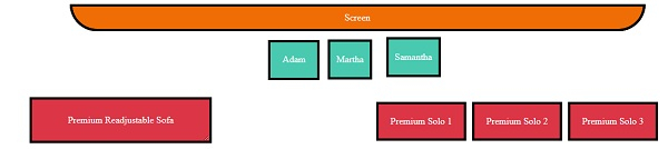
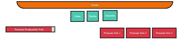
这将产生以下输出 −
当 div 未调整时
当 div 调整时
居中对齐
我们可以使用上面提到的水平对齐和垂直对齐方法将元素居中对齐。
相关文章
有用资源
css 参考教程 - 该教程包含有关 css 的更多信息:https://www.cainiaomax.com/css/

