
如何将 Tensorflow 与 Estimators 结合使用来可视化数据和 ROC 曲线?
tensorflowserver side programmingprogramming更新于 2025/5/20 5:07:17
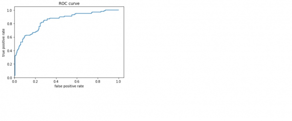
借助‘matplotlib’和‘roc_curve’,可以可视化 titanic 数据集模型并可视化 ROC 曲线以了解性能(存在于‘sklearn.metrics’模块中)方法。
阅读更多: 什么是 TensorFlow,以及 Keras 如何与 TensorFlow 配合使用来创建神经网络?
我们将使用 Keras Sequential API,它有助于构建用于处理普通层堆栈的顺序模型,其中每个层都有一个输入张量和一个输出张量。
包含至少一个层的神经网络称为卷积层。我们可以使用卷积神经网络构建学习模型。
我们使用 Google Colaboratory 运行以下代码。Google Colab 或 Colaboratory 有助于在浏览器上运行 Python 代码,无需任何配置,可以免费访问 GPU(图形处理单元)。Colaboratory 建立在 Jupyter Notebook 之上。
估算器是 TensorFlow 对完整模型的高级表示。它旨在轻松扩展和异步训练。
估算器使用特征列来描述模型如何解释原始输入特征。估算器需要数字输入向量,而特征列将有助于描述模型应如何转换数据集中的每个特征。
示例
from sklearn.metrics import roc_curve
from matplotlib import pyplot as plt
print("The ROC curve, the true positive rate, and the false positive rate are plotted")
fpr, tpr, _ = roc_curve(y_eval, probs)
plt.plot(fpr, tpr)
plt.title('ROC curve')
plt.xlabel('false positive rate')
plt.ylabel('true positive rate')
plt.xlim(0,)
plt.ylim(0,)
代码来源 −https://www.tensorflow.org/tutorials/estimator/linear
输出
The ROC curve, the true positive rate, and the false positive rate are plotted
(0.0, 1.05)
解释
- 接收者操作特性 (ROC) 已可视化。
- 这给出了关于真阳性率和假阳性率之间权衡的想法。

