
如何使用 CSS Flex 将列 DIV 对齐为左-中-右
cssweb developmentfront end technology更新于 2024/5/16 8:44:17
要通过在 Flex 容器周围分配空间来使容器项目沿其主轴对齐,我们使用 CSS 的 justify-content 属性。
语法
CSS justify-content 属性的语法如下 −
Selector {
   display: flex;
    justify-content: /*value*/
}
示例
以下示例演示了 CSS justify-content 属性。
<!DOCTYPE html>
<html>
   <head>
      <style>
         #root {
            margin: 5%;
            display: flex;
            justify-content: space-between;
         }
         #one {
            float:left;
            box-shadow: inset 0 0 34px #b798e1;
         }
         #two {
            box-shadow: inset 0 0 34px #236fa0;
         }
         #three {
            box-shadow: inset 0 0 34px #43946a;
         }
         .element {
            padding: 7%;
            border-radius: 15%;
         }
      </style>
   </head>
   <body>
      <div id="root">
         <div class="element" id="one">1</div>
         <div class="element" id="two">2</div>
         <div class="element" id="three">3</div>
      </div>
   </body>
</html>
这将给出以下输出
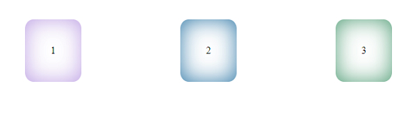
示例
<!DOCTYPE html>
<html>
   <head>
      <style>
         #root {
            margin: 5%;
            padding: 2%;
            display: flex;
            justify-content: space-evenly;
            box-shadow: inset 0 10px 40px magenta;
            font-weight: bold;
         }
         div > div {
            padding: 2%;
            border-radius: 15%;
         }
         div:nth-of-type(even) {
            box-shadow: inset 2px 2px 20px orange;
         }
         div > div:nth-of-type(odd) {
            box-shadow: inset 2px 2px 20px lightblue;
         }
      </style>
   </head>
   <body>
      <div id="root">
         <div>1</div>
         <div>2</div>
         <div>3</div>
         <div>4</div>
         <div>5</div>
         <div>6</div>
      </div>
   </body>
</html>
这将给出以下输出
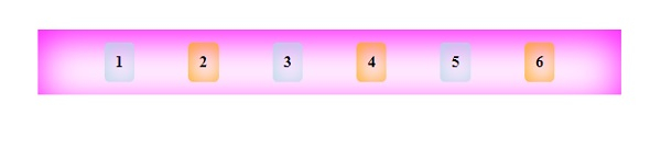
相关文章
有用资源
css 参考教程 - 该教程包含有关 css 的更多信息:https://www.cainiaomax.com/css/