
如何在 CSS 网格中居中?
cssweb developmentfront end technology更新于 2024/7/25 18:52:17
网格以行和列布局的形式排列内容。CSS 网格也一样。
使用 Flex 在 CSS 网格中居中
将网格项设置为 Flex 容器 -
display: flex
要垂直和水平居中,请使用 -
align-items: center;
justify-content: center;
示例
让我们看看完整的示例 -
<!DOCTYPE html>
<html>
<head>
   <title>Grid and Flex Example</title>
   <style>
      html,body {
         margin: 0;
         padding: 0;
      }

      .box {
         display: grid;
         grid-template-columns: 1fr 1fr;
         grid-template-rows: 100vh;
      }

      .first,
      .second {
         display: flex;
         align-items: center;
         justify-content: center;
      }

      .first {
         background-color: orange;
      }

      .second {
         background-color: yellow;
      }
   </style>
</head>
<body>
   <div class="box">
      <div class="first">Left</div>
      <div class="second">Right</div>
   </div>
</body>
</html>
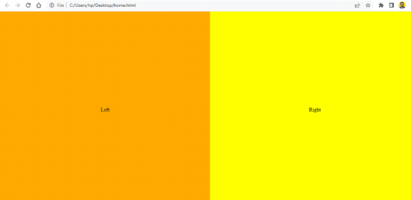
输出
不使用 Flex 在 CSS 网格中居中
我们也可以在不使用 Flex 的情况下居中。我们已将网格容器设置为 display: grid。当 display 属性设置为 grid 时,HTML 元素将成为网格容器 -
grid-container {
    display: grid;
    grid-template-columns: 1fr 1fr;
    grid-auto-rows: 150px;
    grid-gap: 20px;
}
网格项设置了相对定位 -
grid-item {
   position: relative;
   text-align: center;
}
示例
However, the
<!DOCTYPE html>
<html>
<head>
   <title>Grid</title>
   <style>
      grid-container {
         display: grid;
         grid-template-columns: 1fr 1fr;
         grid-auto-rows: 150px;
         grid-gap: 20px;
      }

      grid-item {
         position: relative;
         text-align: center;
      }

      grid-container {
         background-color: red;
         padding: 10px;
      }

      grid-item {
         background-color: orange;
      }
   </style>
</head>
<body>
   <grid-container>
      <grid-item>This is in the center</grid-item>
      <grid-item>This is in the center</grid-item>
   </grid-container>
</body>
</html>
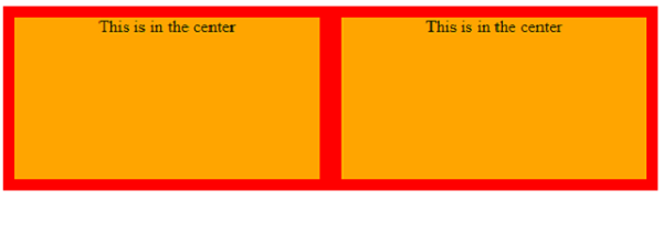
输出
相关文章
有用资源
css 参考教程 - 该教程包含有关 css 的更多信息:https://www.cainiaomax.com/css/