
如何更改 Seaborn 线性回归联合图中的线条颜色?
matplotlibpythondata visualization更新于 2025/6/3 11:56:17
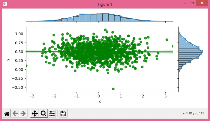
要更改 seaborn 线性回归联合图中的线条颜色,我们可以在 jointplot() 方法中使用 joint_kws。
步骤
- 设置图形大小并调整子图之间和周围的填充。
- 使用 numpy 创建 x 和 y 数据点以制作 Pandas 数据框。
- 使用 jointplot() 方法,并在参数中使用 joint_kws。
- 要显示图形,请使用 show() 方法。
示例
import seaborn as sns
import numpy as np
from matplotlib import pyplot as plt
import pandas as pd

plt.rcParams["figure.figsize"] = [7.50, 3.50]
plt.rcParams["figure.autolayout"] = True

X = np.random.randn(1000,)
Y = 0.2 * np.random.randn(1000) + 0.5

df = pd.DataFrame(dict(x=X, y=Y))
g = sns.jointplot(x="x", y="y", data=df, kind='reg', height=3.5, joint_kws={'color':'green'})

plt.show()
输出
相关文章
有用资源
python 参考教程 - 该教程包含有关 python 的更多信息:https://www.cainiaomax.com/python/

