
如何使用 CSS 创建响应式图像?
cssweb developmentfront end technology更新于 2025/9/29 2:20:17
以下是使用 CSS 创建响应式图像的代码 −
示例
<!DOCTYPE html>
<html>
<head>
<meta name="viewport" content="width=device-width, initial-scale=1">
<style>
img {
   width: 100%;
   max-width: 1000px;
}
</style>
</head>
<body>
<h1>Responsive Images Example</h1>
<h2>Resize the window to see responsive image scale up and down</h2>
<img src="https://images.pexels.com/photos/34950/pexels-photo.jpg?auto=compress&cs=tinysrgb&dpr=2&h=650&w=940">
</body>
</html>
输出
上述代码将产生以下输出 −
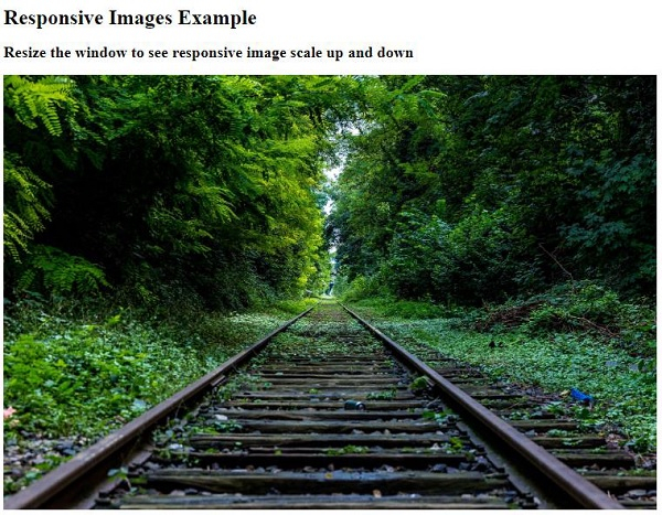
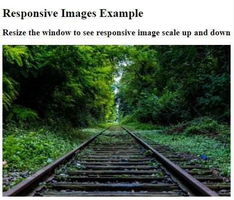
调整浏览器大小时,图像将缩小如下 −
相关文章
有用资源
css 参考教程 - 该教程包含有关 css 的更多信息:https://www.cainiaomax.com/css/

