
如何使用 CSS 创建带图标的响应式导航菜单?
cssweb developmentfront end technology更新于 2025/9/26 15:40:17
以下是创建带图标的响应式导航菜单的代码。
示例
<!DOCTYPE html>
<html lang="en">
<head>
<meta charset="UTF-8">
<meta name="viewport" content="width=device-width, initial-scale=1.0">
<title>Document</title>
<style>
body{
   margin:0px;
   margin-top:10px;
   padding: 0px;
}
nav{
   width: 100%;
   background-color: rgb(39, 39, 39);
   overflow: auto;
   height: auto;
}
.links {
   display: inline-block;
   text-align: center;
   padding: 14px;
   color: rgb(178, 137, 253);
   text-decoration: none;
   font-size: 17px;
}
.links:hover {
   background-color: rgb(100, 100, 100);
}
.selected{
   background-color: rgb(0, 18, 43);
}
@media screen and (max-width: 600px) {
   .links {
      display: block;
   }
}
</style>
</head>
<body>
<nav>
   <a class="links selected" href="#"><i class="fa fa-fw fa-home"></i> Home</a>
   <a class="links" href="#"><i class="fa fa-fw fa-user"></i> Login</a>
   <a class="links" href="#"><i class="fa fa-user-circle-o" aria-hidden="true"></i> Register</a>
   <a class="links" href="#"><i class="fa fa-fw fa-envelope"></i> Contact Us</a>
   <a class="links" href="#"><i class="fa fa-info-circle" aria-hidden="true"></i> More Info</a>
</nav>
</body>
</html>
输出
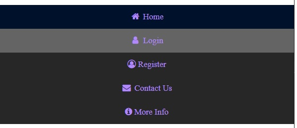
上述代码将产生以下输出 −

当屏幕尺寸调整为 600px 时 −
相关文章
有用资源
css 参考教程 - 该教程包含有关 css 的更多信息:https://www.cainiaomax.com/css/

