
如何在 ReactJS 中创建对话框?
对话框是 ReactJS 中类似于模态框的弹出框。在原生 JavaScript 中,您可能使用过 alert() 方法,该方法允许我们在警告框中显示警告消息。此外,原生 JavaScript 还提供了确认框和提示框来接收用户输入。
对话框还允许我们执行所有操作。我们可以根据需要将常规 HTML 添加到对话框中,使其以弹出框的形式运行。
在本教程中,我们将使用各种库来创建对话框。
使用 Material-Ui 库
Material-Ui 库为 React 提供了许多 UI,对话框就是其中之一。我们可以在项目中安装 Material-Ui npm 包并导入它。
用户可以在终端中执行以下命令,在项目中安装 material-Ui。
npm install @mui/material @emotion/react @emotion/styled
语法
用户可以按照以下语法使用 Material-Ui 库创建对话框。
<Dialog onClose={handleClose} open={open}>
{/* 在此处添加对话框的 HTML*/}
</Dialog>
在上述语法中,我们从 Material-Ui 导入了对话框并将其用作组件。此外,我们需要将 open 的值作为 prop 传递,以控制对话框的显示和隐藏。
示例 1 的步骤
步骤 1 − 从 Material-Ui 库导入 Dialog 和 DialogTitle 组件。
步骤 2 − 在我们的应用中使用 Dialog 组件添加对话框。此外,在 Dialog 组件中使用 DialogTitle 组件为对话框创建标题。
步骤 3 − 此外,将 open 变量作为 Dialog 的 prop 传递,以指示对话框处于打开或关闭状态。此外,当 onClose 事件触发时,我们会调用 handleClose() 函数。
步骤 4 − 在 handleClose() 函数中,使用 handleDisplay() 函数并将 openDialog 变量的值设置为 false 以隐藏对话框。
步骤 5 − 另外,创建一个按钮来打开对话框。当用户点击按钮时,应该调用 openDialogBox() 函数,该函数将 openDialog 变量的值设置为 true。
示例 1
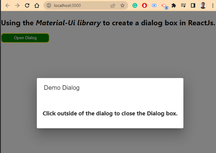
在下面的示例中,我们使用 Material-UI 库创建了一个简单的对话框。我们创建了各种函数来隐藏和显示对话框。此外,我们在 Dialog 组件中添加了行 HTML 并设置了一些样式。
import * as React from "react";
import DialogTitle from "@mui/material/DialogTitle";
import Dialog from "@mui/material/Dialog";
import { height } from "@mui/system";

export default function App(props) {
   const [openDialog, handleDisplay] = React.useState(false);

   const handleClose = () => {
      handleDisplay(false);
   };

   const openDialogBox = () => {
      handleDisplay(true);
   };
   const dialogStyle = {
      padding: "20px",
   };
   const buttonStyle = {
      width: "10rem",
      fontsize: "1.5rem",
      height: "2rem",
      padding: "5px",
      borderRadius: "10px",
      backgroundColor: "green",
      color: "White",
      border: "2px solid yellow",
   };
   return (
      <>
         <h2>
            Using the <i> Material-Ui library </i> to create a dialog box in ReactJs.
         </h2>
         <button style = {buttonStyle} onClick = {openDialogBox}>
            Open Dialog
         </button>
         <Dialog onClose = {handleClose} open = {openDialog}>
            <DialogTitle> Demo Dialog </DialogTitle>
            <h3 style = {dialogStyle}>
               Click outside of the dialog to close the Dialog box.
            </h3>
         </Dialog>
      </>
   );
}
输出
示例 2
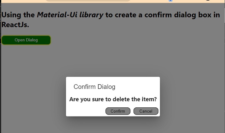
在下面的示例中,我们使用 Material-Ui 库创建了一个确认框。该确认框包含确认和取消按钮。因此,无论用户按下哪个按钮,我们都可以相应地执行一些操作。
在这里,即使用户点击确认框,我们也会关闭确认框。不过,开发者可以创建单独的函数,单独处理确认按钮的点击,而不仅仅是关闭确认对话框。
import * as React from "react";
import DialogTitle from "@mui/material/DialogTitle";
import Dialog from "@mui/material/Dialog";

export default function App(props) {
   const [openDialog, handleDisplay] = React.useState(false);

   const handleClose = () => {
      handleDisplay(false);
   };

   const openDialogBox = () => {
      handleDisplay(true);
   };
   const buttonStyle = {
      width: "10rem",
      fontsize: "1.5rem",
      height: "2rem",
      padding: "5px",
      borderRadius: "10px",
      backgroundColor: "green",
      color: "White",
      border: "2px solid yellow",
   };
   const divStyle = {
      display: "flex",
      felxDirection: "row",
      position: "absolute",
      right: "0px",
      bottom: "0px",
      // padding: "1rem",
   };
   const confirmButtonStyle = {
      width: "5rem",
      height: "1.5rem",
      fontsize: "1rem",
      backgroundColor: "grey",
      color: "black",
      margin: "5px",
      borderRadius: "10px",
      border: "1px solid black",
   };
   return (
      <>
         <h2>
            Using the <i> Material-Ui library </i> to create a confirm dialog box in ReactJs.
         </h2>
         <button style = {buttonStyle} onClick = {openDialogBox}>
            Open Dialog
         </button>
         <Dialog onClose = {handleClose} open = {openDialog}>
            <DialogTitle> Confirm Dialog </DialogTitle>
            <h3 style = {{ marginTop: "-10px", padding: "5px 10px" }}>
                  Are you sure to delete the item? {" "}
            </h3>
            <br></br>
            <div style = {divStyle}>
               <button style = {confirmButtonStyle} onClick = {handleClose}>
                  Confirm
               </button>
               <button style = {confirmButtonStyle} onClick = {handleClose}>
                  Cancel
               </button>
            </div>
         </Dialog>
      </>
   );
}
输出
在本教程中,我们展示了两个使用 Material-Ui 库创建各种对话框的示例。不过,用户也可以使用 react-js-dialog-box 库,让开发者能够创建和自定义对话框。

