
如何使用 CSS 保持元素的宽高比?
cssweb developmentfront end technology更新于 2025/12/3 8:12:17
使用 CSS 保持元素的宽高比,代码如下 −
示例
<!DOCTYPE html>
<html>
<head>
<meta name="viewport" content="width=device-width, initial-scale=1">
<style>
   body{
      font-family: 'Segoe UI', Tahoma, Geneva, Verdana, sans-serif;
   }
   .aspectContainer {
      background-color: rgb(191, 66, 216);
      position: relative;
      width: 100%;
      padding-top: 75%;
   }
   .aspectText {
      position: absolute;
      text-align: center;
      top: 0;
      left: 0;
      bottom: 0;
      right: 0;
      Text-align: center;
      font-size: 20px;
      color: white;
   }
</style>
</head>
<body>
<h1>Aspect ratio example</h1>
<div class="aspectContainer">
<div class="aspectText">4:3 Aspect ratio</div>
</div>
<h2>Resize the window to see 4:3 aspect ratio in action</h2>
</body>
</html>
输出
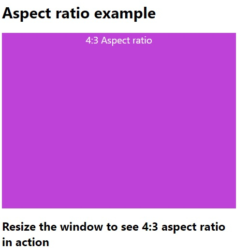
上述代码将产生以下输出 −
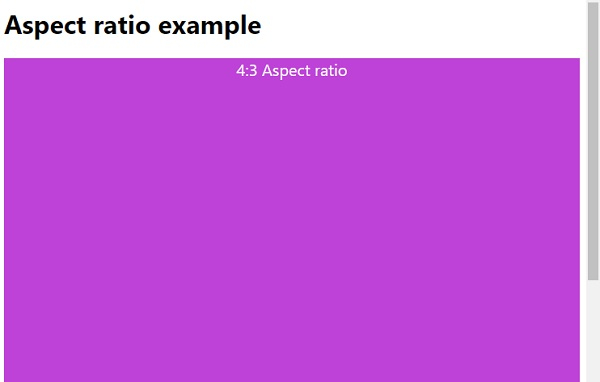
调整窗口大小时,元素将按 4:3 的比例缩小 −
相关文章
有用资源
css 参考教程 - 该教程包含有关 css 的更多信息:https://www.cainiaomax.com/css/

