
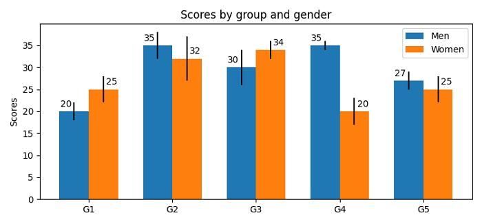
如何在 Matplotlib 中绘制带有多个标签的条形图?
matplotlibpythondata visualization更新于 2025/6/3 19:56:17
要在 Matplotlib 中绘制带有多个标签的条形图,我们可以采取以下步骤 −
为 men_means、men_std、women_means 和 women_std 创建一些数据集。
使用 numpy 创建索引数据点。
初始化条形的 width。
使用 subplots() 方法创建一个图形和一组子图。
使用 bar() 方法创建 rects1 和 rects2 条形矩形。
使用set_ylabel(), set_title(),set_xticks() 和 set_xticklabels() 方法。
在图表上放置图例。
使用 autolabel() 方法为条形图添加多个标签。
要显示图形,请使用 show() 方法。
示例
import matplotlib.pyplot as plt
import numpy as np

plt.rcParams["figure.figsize"] = [7.50, 3.50]
plt.rcParams["figure.autolayout"] = True

men_means, men_std = (20, 35, 30, 35, 27), (2, 3, 4, 1, 2)
women_means, women_std = (25, 32, 34, 20, 25), (3, 5, 2, 3, 3)

ind = np.arange(len(men_means)) # the x locations for the groups
width = 0.35 # the width of the bars

fig, ax = plt.subplots()
rects1 = ax.bar(ind - width/2, men_means, width, yerr=men_std, label='Men')
rects2 = ax.bar(ind + width/2, women_means, width, yerr=women_std, label='Women')

ax.set_ylabel('Scores')
ax.set_title('Scores by group and gender')
ax.set_xticks(ind)
ax.set_xticklabels(('G1', 'G2', 'G3', 'G4', 'G5'))
ax.legend()

def autolabel(rects, xpos='center'):
   ha = {'center': 'center', 'right': 'left', 'left': 'right'}
   offset = {'center': 0, 'right': 1, 'left': -1}
   for rect in rects:
      height = rect.get_height()
      ax.annotate('{}'.format(height),
         xy=(rect.get_x() + rect.get_width() / 2, height),
           xytext=(offset[xpos]*3, 3), # 使用 3 点偏移
         textcoords="offset points", # 两个方向
         ha=ha[xpos], va='bottom')

autolabel(rects1, "left")
autolabel(rects2, "right")
plt.show()
输出
相关文章
有用资源
python 参考教程 - 该教程包含有关 python 的更多信息:https://www.cainiaomax.com/python/

