
如何使用 CSS 设置轮廓按钮的样式?
cssweb developmentfront end technology更新于 2025/10/5 1:16:17
以下是使用 CSS 设置轮廓按钮样式的代码 −
示例
<!DOCTYPE html>
<html>
<head>
<meta name="viewport" content="width=device-width, initial-scale=1" />
<style>
button {
   font-family: 'Segoe UI', Tahoma, Geneva, Verdana, sans-serif;
   border: none;
   color: white;
   font-weight: bolder;
   padding: 20px;
   font-size: 20px;
   cursor: pointer;
   border-radius: 6px;
   width: 140px;
}
.Success {
   border:2px solid #4caf50;
   color:#4caf50
}
.Success:hover {
   background-color: #46a049;
   color:white;
}
.Info {
   border:2px solid #2196f3;
   color:#2196f3;
}
.Info:hover {
   background: #0b7dda;
   color:white;
}
.Warning {
   border:2px solid #ff9800;
   color:#ff9800;
}
.Warning:hover {
   background: #e68a00;
   color:white;
}
.Danger {
   border:2px solid #f44336;
   color:#f44336;
}
.Danger:hover {
   background: #da190b;
   color:white;
}
.Default {
   border:2px solid #e7e7e7;
   color: black;
}
.Default:hover {
   background: #ddd;
}
</style>
</head>
<body>
<h1>Alert Buttons Example</h1>
<button class="Success">Success</button>
<button class="Info">Info</button>
<button class="Warning">Warning</button>
<button class="Danger">Danger</button>
<button class="Default">Default</button>
</body>
</html>
输出
上述代码将产生以下输出 −
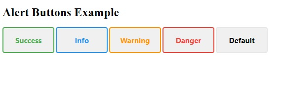
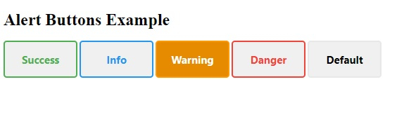
当鼠标悬停在按钮上时,按钮背景颜色将与轮廓相同,如图所示 −
相关文章
有用资源
css 参考教程 - 该教程包含有关 css 的更多信息:https://www.cainiaomax.com/css/

