
使用 CSS 保持 HTML 视频的宽高比
cssweb developmentfront end technology更新于 2024/8/29 21:32:17
通过以百分比指定元素的填充,我们可以保持其宽高比。
为此,请使用 CSS padding 属性 −
padding-bottom 指定元素的底部填充。
padding-top 指定元素的顶部填充。
padding-left 指定元素的左侧填充。
padding-right 指定元素的右侧填充。
padding 是上述属性。
示例
以下示例说明了 CSS padding 属性如何保持宽高比。
<!DOCTYPE html>
<html>
<head>
<style>
#demo {
   padding-top: 100%;
   box-shadow: 0 0 24px steelblue;
   position: relative;
   width: 100%;
}
div > div {
   margin: 10px;
   position: absolute;
   top: 0;
   right: 0;
   bottom: 0;
   left: 0;
   text-align: center;
}
</style>
</head>
<body>
<p>Watch the below div</p>
<div id="demo">
<div>Fun Ratio!</div>
</div>
</body>
</html>
输出
这将产生以下结果 −
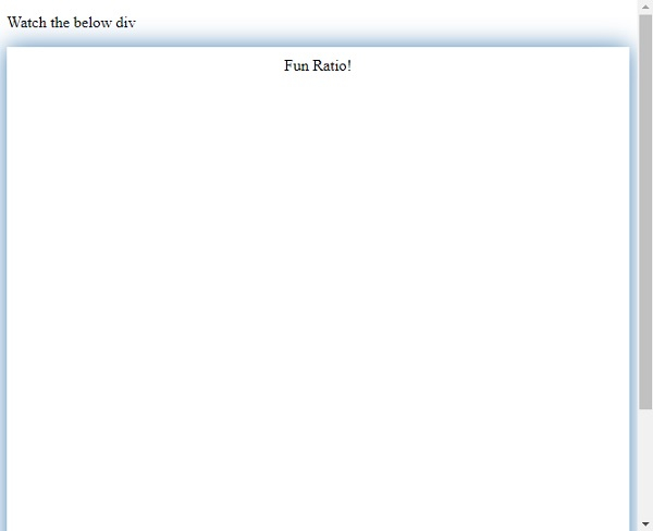
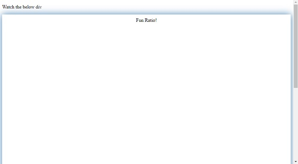
即使调整窗口大小后,宽高比仍保持 1:1。
示例
<!DOCTYPE html>
<html>
<head>
<style>
div {
   margin: 10%;
   padding-top: 56.25%;
   height: 0px;
   position: relative;
   box-shadow: 0 0 0 20px antiquewhite;
}
iframe {
   position: absolute;
   top: 0;
   height: 100%;
   width: 100%;
}
</style>
</head>
<body>
<div>
<iframe src="https://www.youtube.com/embed/0cwk9UMLnWE" frameborder="0" allow="accelerometer; autoplay; clipboard-write; encrypted-media; gyroscope; picture-inpicture" allowfullscreen></iframe>
</div>
</body>
</html>
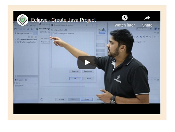
输出
这将产生以下结果 −
相关文章
有用资源
css 参考教程 - 该教程包含有关 css 的更多信息:https://www.cainiaomax.com/css/