
使用 Python 的 pandas 从数据框制作 matplotlib 散点图
pythonpandasserver side programmingprogramming更新于 2024/9/28 0:44:17
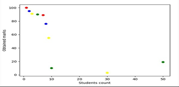
使用 Pandas,我们可以创建一个数据框,并可以使用 subplot() 方法创建一个图形和轴变量。之后,我们可以使用 ax.scatter() 方法来获取所需的图。
步骤
列出学生人数。
列出学生已获得的分数。
为了表示每个散点的颜色,我们可以有一个颜色列表。
使用 Pandas,我们可以有一个表示数据框轴的列表。
使用 subplots 方法创建 fig 和 ax 变量,其中默认 nrows 和 ncols 为 1。
使用 plt.xlabel() 方法设置"学生人数"标签。
设置"已获得分数"使用 plt.ylabel() 方法进行标记。
要创建散点,请使用步骤 4 中创建的数据框。点为学生人数、分数和颜色。
要显示图形,请使用 plt.show() 方法。
示例
from matplotlib import pyplot as plt
import pandas as pd

no_of_students = [1, 2, 3, 5, 7, 8, 9, 10, 30, 50]
marks_obtained_by_student = [100, 95, 91, 90, 89, 76, 55, 10, 3, 19]
color_coding = ['red', 'blue', 'yellow', 'green', 'red', 'blue', 'yellow', 'green', 'yellow', 'green']

df = pd.DataFrame(dict(students_count=no_of_students,
marks=marks_obtained_by_student, color=color_coding))

fig, ax = plt.subplots()

plt.xlabel('Students count')
plt.ylabel('Obtained marks')

ax.scatter(df['students_count'], df['marks'], c=df['color'])

plt.show()
输出
相关文章
有用资源
python 参考教程 - 该教程包含有关 python 的更多信息:https://www.cainiaomax.com/python/

