
Python - 使用 Matplotlib 为 Pandas Dataframe 绘制饼图?
matplotlibpythondata visualization更新于 2025/11/23 9:48:17
要绘制饼图,请使用 plot.pie()。饼图是列中数值数据的比例表示。
导入所需的库 −
import pandas as pd
import matplotlib.pyplot as plt
创建 DataFrame −
dataFrame = pd.DataFrame({
"Car": ['BMW', 'Lexus', 'Tesla', 'Mustang', 'Mercedes', 'Jaguar'],"Reg_Price": [7000, 1500, 5000, 8000, 9000, 6000]
})
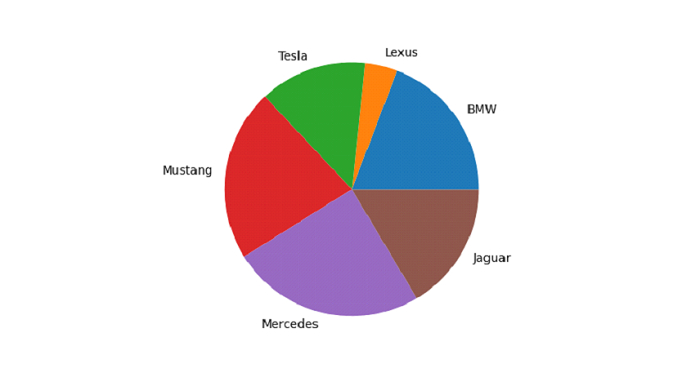
绘制带有标签 Car 列 − 的 Registration Price 列饼图
plt.pie(dataFrame["Reg_Price"], labels = dataFrame["Car"])
示例
以下是代码 −
import pandas as pd
import matplotlib.pyplot as plt

# 创建 DataFrame
dataFrame = pd.DataFrame({
   "Car": ['BMW', 'Lexus', 'Tesla', 'Mustang', 'Mercedes', 'Jaguar'],"Reg_Price": [7000, 1500, 5000, 8000, 9000, 6000]
})

# 绘制带有 Car 标签的 Registration Price 列的饼图
plt.pie(dataFrame["Reg_Price"], labels = dataFrame["Car"])
plt.show()
输出
这将产生以下输出 −
相关文章
有用资源
python 参考教程 - 该教程包含有关 python 的更多信息:https://www.cainiaomax.com/python/

