
理解 CSS 媒体类型和查询
cssweb developmentfront end technology更新于 2025/1/10 21:00:17
CSS 媒体类型和查询帮助用户根据设备的常规类型(屏幕、打印等)或其特性(屏幕分辨率、视口尺寸等)定义某些样式。
语法
以下是媒体查询的语法 −
@media not | only mediatype and (expressions) {
   CSS-Code;
}
此处,如果 − 则应用媒体查询。
- mediatype 与呈现文档的设备类型匹配。
- 如果未定义 not/only 运算符,则媒体查询将应用于所有媒体类型。
- 如果指定了 not/only 运算符,则媒体查询将 not/only 分别应用于特定媒体类型。
用户可以拥有不同的样式表,每个样式表对应不同的媒体。例如,用户可以为打印媒体和屏幕媒体使用不同的样式表。
<link rel="stylesheet" media="print and|not|only (expressions)" href="print.css">
并且
<link rel="stylesheet" media="screen and|not|only (expressions)" href="screen.css">
以下是 CSS3 中列出的媒体类型 −
| Sr.No | Value &说明 |
|---|---|
| 1 | all 样式表适用于所有媒体类型设备 |
| 2 | print 样式表适用于打印机 |
| 3 | screen 样式表适用于电脑屏幕、平板电脑、智能手机等。 |
| 4 | 语音 样式表适用于大声"朗读"页面的屏幕阅读器 |
以下是创建媒体相关样式表的方法 −
- 使用 @media 规则
- 使用 @import 规则
- 使用带有 media 属性的 HTML <link> 元素
示例
让我们看一个 CSS 媒体查询的示例 −
<!DOCTYPE html>
<html>
<head>
<meta name="viewport" content="width=device-width, initial-scale=1">
<style>
* {
   box-sizing: border-box;
}
.col {
   float: left;
   width: 20%;
   padding: 40px;
}
body {
   background-color: lemonchiffon;
   margin: 20px;
}
@media screen and (max-width: 850px) {
   .col {
      width: 50%;
   }
   body {
      background-color: mediumseagreen;
   }
}
@media screen and (max-width: 550px) {
   .col {
      width: 100%;
   }
   body {
      background-color: powderblue;
   }
}
</style>
</head>
<body>
<div class="row">
<div class="col" style="background-color:#373;"> </div>
<div class="col" style="background-color:#363;"> </div>
<div class="col" style="background-color:#353;"> </div>
<div class="col" style="background-color:#343;"> </div>
<div class="col" style="background-color:#333;"> </div>
</div></body></html>
输出
这将产生以下输出 −
当屏幕尺寸大于 850px 时 −

当屏幕尺寸介于 550px 和 850px 之间时 −
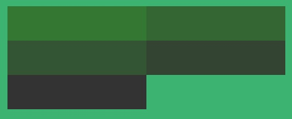
当屏幕尺寸小于 550px 时 −
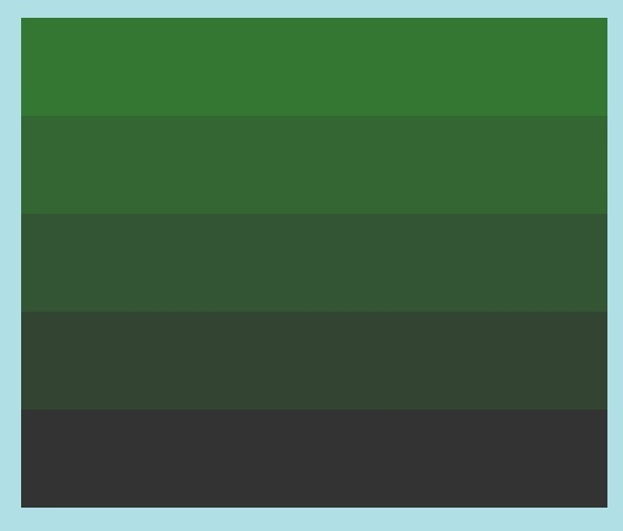
示例
让我们看另一个 CSS 媒体查询示例:HTML 文档 −
<!DOCTYPE html>
<html>
<head>
<style type="text/css">
@import url(screen.css) screen;
@import url(print.css) print;
</style>
</head>
<body>
<p> Vivamus commodo, dolor eu porttitor sagittis, orci nisl consectetur ipsum, vel volutpat nibh lectus at erat. Cras scelerisque faucibus tellus aliquam commodo.Donec sem urna, facilisis at ipsum id, viverra sollicitudin est. Nam rhoncus sollicitudin lorem, a accumsan purus varius eget. </p>
<p class="two">In ultrices lectus nisi. Nulla varius ex ut tortor congue viverra. Sed sodales vehicula leo, vitae interdum elit vehicula nec. Donec turpis nunc, iaculis et nisi sit amet, feugiat lacinia metus. </p>
<p>Suspendisse eget ligula et risus lobortis ornare id at elit. Suspendisse potenti. Vivamus pellentesque eleifend pellentesque. Vestibulum neque ante, iaculis a sagittis et, fermentum at metus.</p>
</body>
</html>
CSS document (screen.css):
p { color: navy; font-style: italic; }
.two { color: #c303c3; font-size: 20px; }
body { background-color: honeydew;}

CSS document (print.css):
p { color: red; font-style: italic;}
.two { color: #989898; font-size: 40px; }
输出
这将产生以下输出 −
当文档在屏幕媒体类型中可见时 −
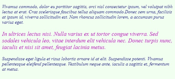
当文档在打印媒体类型中可见时 −
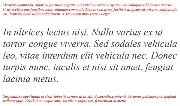
相关文章
有用资源
css 参考教程 - 该教程包含有关 css 的更多信息:https://www.cainiaomax.com/css/

