
堆叠和分组柱形图
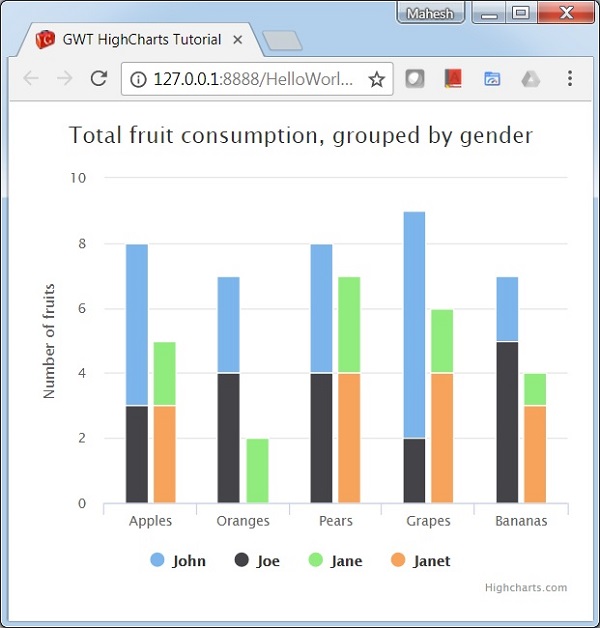
以下是堆叠和分组柱形图的示例。
我们已经在Highcharts 配置语法一章中看到了用于绘制图表的配置。现在让我们看看其他配置,以及我们如何在plotoptions中添加堆叠属性。
下面给出了堆叠和分组柱形图的示例。
plotOptions
plotOptions 是每个系列类型的配置对象的包装器对象。每个系列的配置对象也可以针对系列数组中给出的每个系列项目进行覆盖。这是将每个系列的值堆叠在一起。这是为了将每个系列的值堆叠在一起。
使用 plotOptions.column.stacking 将图表的堆叠配置为"normal"。可能的值是 null(禁用堆叠)、"normal"按值堆叠和"percent"按百分比堆叠图表。
chart.setColumnPlotOptions(new ColumnPlotOptions()
   .setStacking(Stacking.NORMAL)
);
系列
配置每个系列的堆栈以识别该系列的组。
chart.addSeries(chart.createSeries()
   .setName("John")
   .setPoints(new Number[] {5, 3, 4, 7, 2})
   .setStack("male")
);
示例
HelloWorld.java
package com.tutorialspoint.client;

import org.moxieapps.gwt.highcharts.client.Chart;
import org.moxieapps.gwt.highcharts.client.Series.Type;
import org.moxieapps.gwt.highcharts.client.plotOptions.ColumnPlotOptions;
import org.moxieapps.gwt.highcharts.client.plotOptions.PlotOptions.Stacking;

import com.google.gwt.core.client.EntryPoint;
import com.google.gwt.user.client.ui.RootPanel;

public class HelloWorld implements EntryPoint {
   public void onModuleLoad() {
      final Chart chart = new Chart()
         .setType(Type.COLUMN)
         .setChartTitleText("Total fruit consumption, grouped by gender")
         .setColumnPlotOptions(new ColumnPlotOptions()
            .setStacking(Stacking.NORMAL)
         );

      chart.getXAxis()
         .setCategories("Apples", "Oranges", "Pears", "Grapes", "Bananas");

      chart.getYAxis()
         .setAllowDecimals(false)
         .setMin(0)
         .setAxisTitleText("Number of fruits");

      chart.addSeries(chart.createSeries()
         .setName("John")
         .setPoints(new Number[] {5, 3, 4, 7, 2})
         .setStack("male")
      );
      chart.addSeries(chart.createSeries()
         .setName("Joe")
         .setPoints(new Number[] {3, 4, 4, 2, 5})
         .setStack("male")
      );
      chart.addSeries(chart.createSeries()
         .setName("Jane")
         .setPoints(new Number[] {2, 2, 3, 2, 1})
         .setStack("female")
      );
      chart.addSeries(chart.createSeries()
         .setName("Janet")
         .setPoints(new Number[] {3, 0, 4, 4, 3})
         .setStack("female")
      );
      RootPanel.get().add(chart);
   }
}
结果
验证结果。
 gwt_highcharts_column_charts.html

