
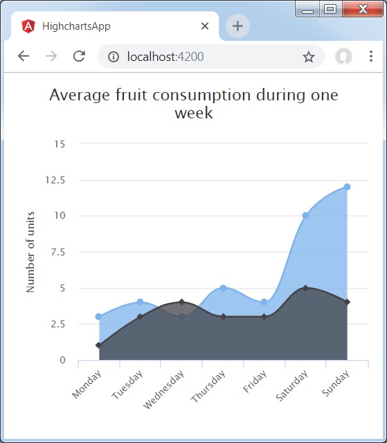
使用样条线的面积图
我们已经在 Highcharts 配置语法 章节中看到了用于绘制图表的配置。 现在,让我们看一个使用样条线的面积图的示例。 我们还将了解其他配置。 我们更改了图表中的类型属性。
图表
将图表类型配置为基于"areaspline"。 chart.type 决定图表的系列类型。 这里,默认值为"line"。
var chart = {
   type: 'areaspline'
};
示例
app.component.ts
import { Component } from '@angular/core';
import * as Highcharts from 'highcharts';
@Component({
   selector: 'app-root',
   templateUrl: './app.component.html',
   styleUrls: ['./app.component.css']
})
export class AppComponent {
   highcharts = Highcharts;
   chartOptions = {
      chart: {
        type: 'areaspline'
      },
      title: {
        text: '一周平均水果消耗量'
      },
      subtitle : {
         style: {
            position: 'absolute',
            right: '0px',
            bottom: '10px'
         }
      },
      legend : {
         layout: 'vertical',
         align: 'left',
         verticalAlign: 'top',
         x: -150,
         y: 100,
         floating: true,
         borderWidth: 1,

         backgroundColor: (
            Highcharts.theme && Highcharts.theme.legendBackgroundColor) ||
              '#FFFFFF'
      },
      xAxis:{
         categories: ['Monday','Tuesday','Wednesday','Thursday',
            'Friday','Saturday','Sunday']
      },
      yAxis : {
         title: {
            text: '单位数'
         }
      },
      tooltip : {
         shared: true, valueSuffix: ' units'
      },
      plotOptions : {
         area: {
            fillOpacity: 0.5
         }
      },
      credits:{
        enabled: false
      },
      series: [
         {
            name: 'John',
            data: [3, 4, 3, 5, 4, 10, 12]
         },
         {
            name: 'Jane',
            data: [1, 3, 4, 3, 3, 5, 4]
         }
      ]
   };
}
结果
验证结果。
❮ angular_highcharts_area_charts.html

