
Angular Highcharts - 堆积柱形图
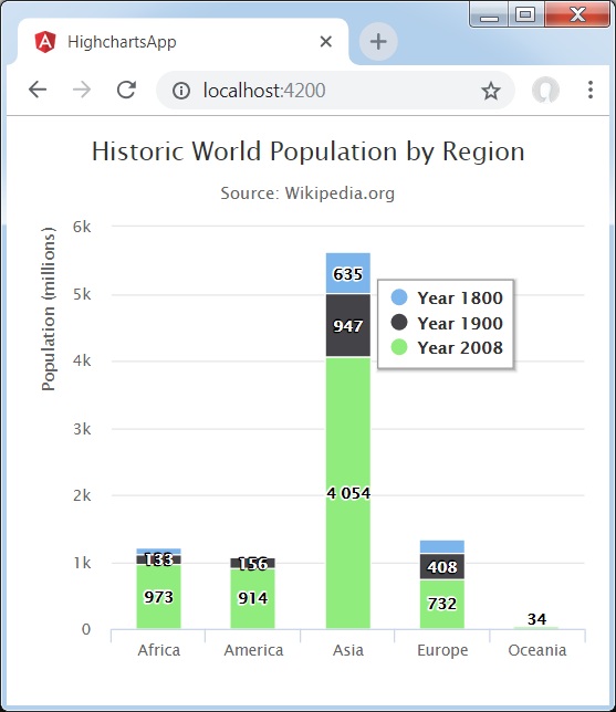
以下是堆积柱形图的示例。
我们已经在 Highcharts 配置语法 章节中看到了用于绘制图表的配置。 现在,让我们看一个堆积柱形图的示例。 我们还将了解其他配置。
plotOptions
使用plotOptions.series.stacking将图表的堆积配置为"normal"。 可能的值为 null,这会禁用堆积,"normal"按值堆积,"percent"按百分比堆积系列。
var plotOptions = {
   series: {
      stacking: 'normal'
   }
};
示例
app.component.ts
import { Component } from '@angular/core';
import * as Highcharts from 'highcharts';
@Component({
   selector: 'app-root',
   templateUrl: './app.component.html',
   styleUrls: ['./app.component.css']
})
export class AppComponent {
   highcharts = Highcharts;
   chartOptions = {
      chart: {
         type: 'column'
      },
      title: {
         text: '按地区划分的历史世界人口'
      },
      subtitle : {
         text: 'Source: Wikipedia.org'
      },
      legend : {
         layout: 'vertical',
         align: 'left',
         verticalAlign: 'top',
         x: 250,
         y: 100,
         floating: true,
         borderWidth: 1,

         backgroundColor: (
            (Highcharts.theme && Highcharts.theme.legendBackgroundColor) ||
               '#FFFFFF'), shadow: true
      },
      xAxis:{
         categories: ['Africa', 'America', 'Asia', 'Europe', 'Oceania'], title: {
            text: null
         }
      },
      yAxis : {
         min: 0,
         title: {
            text: 'Population (millions)',
            align: 'high'
         },
         labels: {
            overflow: 'justify'
         }
      },
      tooltip : {
         valueSuffix: ' millions'
      },
      plotOptions : {
         column: {
            dataLabels: {
               enabled: true
            }
         },
         series: {
            stacking: 'normal'
         }
      },
      credits:{
         enabled: false
      },
      series: [
         {
            name: 'Year 1800',
            data: [107, 31, 635, 203, 2]
         },
         {
            name: 'Year 1900',
            data: [133, 156, 947, 408, 6]
         },
         {
            name: 'Year 2008',
            data: [973, 914, 4054, 732, 34]
         }
      ]
   };
}
结果
验证结果。
❮ angular_highcharts_column_charts.html

