
在 Matplotlib 中更改单个 X 轴刻度标签的颜色
matplotlibpythondata visualization更新于 2025/9/11 1:48:17
要更改 matplotlib 中单个 X 轴刻度标签的颜色,我们可以采取以下步骤 −
- 设置图形大小并调整子图之间和周围的填充。
- 创建新图形或激活现有图形。
- 添加 '~.axes.Axes'作为子图排列的一部分添加到图中。
- 使用 numpy 创建 x 和 y 数据点。
- 使用 plot() 方法绘制 x 和 y 数据点。
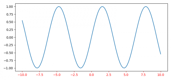
- 要在 matplotlib 中设置 X 轴刻度标签的颜色,我们可以使用 tick_params() 方法,其中 axis='x' 和 color='red'。
- 要显示图形,请使用 show() 方法。
示例
import numpy as np
from matplotlib import pyplot as plt

plt.rcParams["figure.figsize"] = [7.50, 3.50]
plt.rcParams["figure.autolayout"] = True

fig = plt.figure()
ax = fig.add_subplot(111)

x = np.linspace(-10, 10, 100)
y = np.sin(x)

plt.plot(x, y)

ax.tick_params(axis='x', colors='red')

plt.show()
输出

相关文章
有用资源
python 参考教程 - 该教程包含有关 python 的更多信息:https://www.cainiaomax.com/python/
打印
下一节:比 contains_point 方法更快地检查点是否在椭圆内(Matplotlib) ❯❮ 上一节:如何适当地绘制从 MLPClassifier 获得的(loss_curve_)损失值? (Matplotlib)

