
如何在 Android 中创建圆形确定性进度条?
Android 中的圆形确定性进度条是一种可视化元素,以圆形形状显示任务的进度。与模糊进度条不同,模糊进度条会不断刷新,但不会显得特别复杂,而确定性进度条会显示明确的进度值。它通常由一个圆形和一个进度标记组成,进度标记会根据任务的完成情况填充圆形。圆形确定性进度条允许用户直观地了解特定任务(例如下载文件或上传文件)的进度。通过以编程方式设置进度值,开发人员可以自定义进度条,使其反映持续任务的实际进度,并以直观易懂的方式让用户清晰地了解任务的完成状态。
使用的方法
手动实现
手动实现
手动实现是指在 Android 中创建圆形、固定进度条的方法,即通过代码自定义其行为和外观,而不是完全依赖预定义的组件或库。它包括以编程方式定义和控制进度条的进度,使开发人员能够对其功能进行精细的控制。通过手动执行圆形固定进度条,开发人员可以根据特定需求自定义其大小、颜色、活动和高级功能。这种方法提供了灵活性,使开发人员能够创建有趣且定制化的数字指针,并与他们的 Android 应用程序始终兼容。
算法
创建一个包含 ProgressBar 元素的格式化文件 (XML)。设置大小、颜色和可见性等关键属性。
在 Java 课程中,使用 findViewById() 获取对 ProgressBar 的引用,并将其赋值给一个变量。
使用 setMax() 设置进度条的最大值。此值表示可以实现的最大进度。
根据应用程序的逻辑或任务进度确定当前进度值。此值应介于步骤 3 中设置的最高值和最低值之间。
使用 setProgress() 设置当前进度值。
您也可以使用 setIndeterminateDrawable()、setProgressDrawable() 或 setProgressTintList() 等方法自定义 ProgressBar 的外观。
重复步骤 4 和 5,在需要时更新进度值。
示例
创建可绘制资源文件
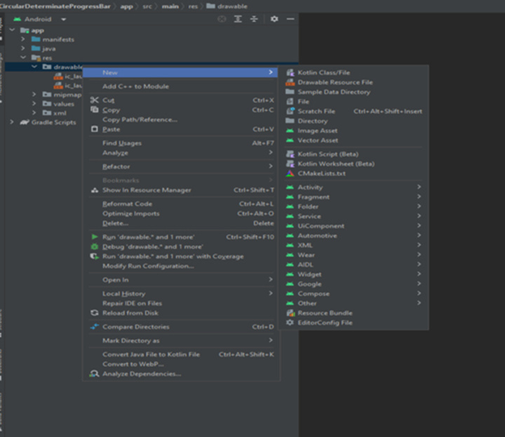
XML 文件
<?xml version="1.0" encoding="utf-8"?>
<layer-list xmlns:android="http://schemas.android.com/apk/res/android">
   <!-- Adding the first item: A ring shape -->
	<item>
		<!-- Create a ring shape using the "ring" attribute.
		To make the ring appear with color code "#DDD", set android:useLevel="false". -->
		<shape
			android:shape="ring"
			android:thicknessRatio="16"
			android:useLevel="false">
			<solid android:color="#DDD" />
		</shape>
	</item>
	<!-- Adding the second item: A rotating ring -->
	<item>
		<!-- Rotate the ring from 270 degrees to 270 degrees -->
		<rotate
			android:fromDegrees="270"
			android:toDegrees="270">
			<!-- Use android:useLevel="true" in the shape tag to enable rotation.
			Add a gradient to set the startColor and endColor of the ring. -->
			<shape
				android:shape="ring"
				android:thicknessRatio="16"
				android:useLevel="true">
				<gradient
					android:endColor="@color/teal_700"
					android:startColor="@color/black"
					android:type="sweep" />
			</shape>
		</rotate>
	</item>
</layer-list>
输出

主题的 XML 程序
<resources xmlns:tools="http://schemas.android.com/tools">
   <!-- Base application theme. -->
	<style name="Theme.ProgressBar" parent="Theme.MaterialComponents.DayNight.DarkActionBar">
		<!-- Primary brand color. -->
		<item name="colorPrimary">@color/green</item>
		<item name="colorPrimaryVariant">@color/green</item>
		<item name="colorOnPrimary">@color/white</item>
		<!-- Secondary brand color. -->
		<item name="colorSecondary">@color/teal_200</item>
		<item name="colorSecondaryVariant">@color/teal_700</item>
		<item name="colorOnSecondary">@color/black</item>
		<!-- Status bar color. -->
		<item name="android:statusBarColor" tools:targetApi="l">?attr/colorPrimaryVariant</item>
		<!-- Customize your theme here. -->
	</style>


	<!-- Style for Circular Determinate ProgressBar -->
	<style name="CircularDeterminateProgressBar">
		<item name="android:indeterminateOnly">false</item>
		<item name="android:progressDrawable">@drawable/circle</item>
	</style>

</resources>
主 XML 程序
<?xml version="1.0" encoding="utf-8"?>
<androidx.constraintlayout.widget.ConstraintLayout
   xmlns:android="http://schemas.android.com/apk/res/android"
   xmlns:app="http://schemas.android.com/apk/res-auto"
   xmlns:tools="http://schemas.android.com/tools"
   android:layout_width="match_parent"
   android:layout_height="match_parent"
   tools:context=".MainActivity">

   <!-- Add ProgressBar. The main attributes used here are:
      - style="@style/CircularDeterminateProgressBar" that
      references the style created in the theme.xml file above.
      - android:progressDrawable="@drawable/circle" that
      references the drawable created in the circle.xml file above.
   -->
   <ProgressBar
      android:id="@+id/progress_bar"
      style="@style/CircularDeterminateProgressBar"
      android:layout_width="200dp"
      android:layout_height="200dp"
      android:indeterminateOnly="false"
      android:progress="60"
      android:progressDrawable="@drawable/circle"
      android:rotation="-90"
      app:layout_constraintBottom_toBottomOf="parent"
      app:layout_constraintLeft_toLeftOf="parent"
      app:layout_constraintRight_toRightOf="parent"
      app:layout_constraintTop_toTopOf="parent"
      tools:progress="60" />

   <!-- TextView to display the progress percentage -->
   <TextView
      android:id="@+id/text_view_progress"
      android:layout_width="wrap_content"
      android:layout_height="wrap_content"
      android:textAppearance="@style/TextAppearance.AppCompat.Large"
      app:layout_constraintBottom_toBottomOf="@+id/progress_bar"
      app:layout_constraintEnd_toEndOf="@+id/progress_bar"
      app:layout_constraintStart_toStartOf="@+id/progress_bar"
      app:layout_constraintTop_toTopOf="@+id/progress_bar"
      tools:text="60%" />

   <!-- Decrement button that will decrease the progress by 10% -->
   <Button
      android:id="@+id/button_decr"
      android:layout_width="wrap_content"
      android:layout_height="wrap_content"
      android:text="- 10%"
      app:layout_constraintStart_toStartOf="@+id/progress_bar"
      app:layout_constraintTop_toBottomOf="@+id/progress_bar" />

   <!-- Increment button that will increase the progress by 10% -->
   <Button
      android:id="@+id/button_incr"
      android:layout_width="wrap_content"
      android:layout_height="wrap_content"
      android:text="+ 10%"
      app:layout_constraintEnd_toEndOf="@+id/progress_bar"
      app:layout_constraintTop_toBottomOf="@+id/progress_bar" />

</androidx.constraintlayout.widget.ConstraintLayout>
主 XML 程序
<?xml version="1.0" encoding="utf-8"?>
<androidx.constraintlayout.widget.ConstraintLayout
   xmlns:android="http://schemas.android.com/apk/res/android"
   xmlns:app="http://schemas.android.com/apk/res-auto"
   xmlns:tools="http://schemas.android.com/tools"
   android:layout_width="match_parent"
   android:layout_height="match_parent"
   tools:context=".MainActivity">

   <ProgressBar
      android:id="@+id/progress_bar"
      style="@style/CircularDeterminateProgressBar"
      android:layout_width="250dp"
      android:layout_height="250dp"
      android:progress="60"
      android:rotation="-90"
      app:layout_constraintBottom_toBottomOf="parent"
      app:layout_constraintLeft_toLeftOf="parent"
      app:layout_constraintRight_toRightOf="parent"
      app:layout_constraintTop_toTopOf="parent"
      tools:progress="60" />

   <TextView
      android:id="@+id/text_view_progress"
      android:layout_width="wrap_content"
      android:layout_height="wrap_content"
      android:textAppearance="@style/TextAppearance.AppCompat.Large"
      app:layout_constraintBottom_toBottomOf="@+id/progress_bar"
      app:layout_constraintEnd_toEndOf="@+id/progress_bar"
      app:layout_constraintStart_toStartOf="@+id/progress_bar"
      app:layout_constraintTop_toTopOf="@+id/progress_bar"
      tools:text="60%" />

   <Button
      android:id="@+id/button_decr"
      android:layout_width="100dp"
      android:layout_height="wrap_content"
      android:text="- 10%"
      app:layout_constraintStart_toStartOf="@+id/progress_bar"
      app:layout_constraintTop_toBottomOf="@+id/progress_bar"
      android:onClick="decrementProgress" />

   <Button
      android:id="@+id/button_incr"
      android:layout_width="100dp"
      android:layout_height="wrap_content"
      android:text="+ 10%"
      app:layout_constraintEnd_toEndOf="@+id/progress_bar"
      app:layout_constraintTop_toBottomOf="@+id/progress_bar"
      android:onClick="incrementProgress" />

</androidx.constraintlayout.widget.ConstraintLayout>
输出
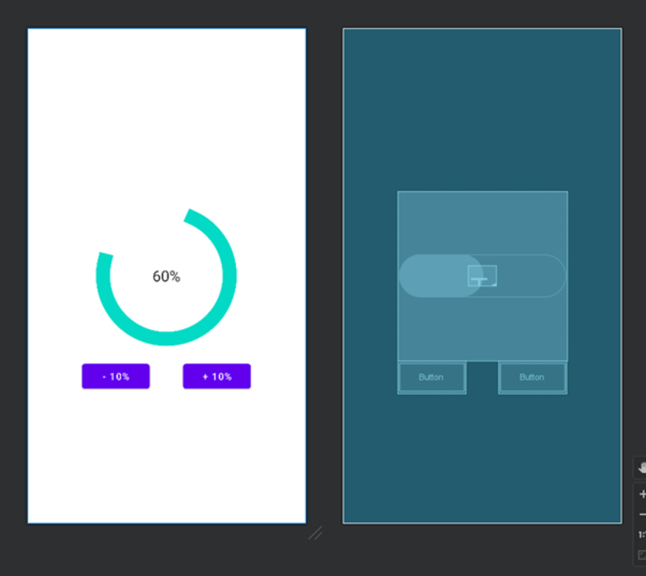
import android.os.Bundle;
import android.view.View;
import android.widget.Button;
import android.widget.ProgressBar;
import android.widget.TextView;

import androidx.appcompat.app.AppCompatActivity;

public class MainActivity extends AppCompatActivity {
   private ProgressBar progressBar;
   private TextView textViewProgress;
   private Button buttonDecr;
   private Button buttonIncr;

   private int progress;

   @Override
   protected void onCreate(Bundle savedInstanceState) {
      super.onCreate(savedInstanceState);
      setContentView(R.layout.activity_main);

      progressBar = findViewById(R.id.progress_bar);
      textViewProgress = findViewById(R.id.text_view_progress);
      buttonDecr = findViewById(R.id.button_decr);
      buttonIncr = findViewById(R.id.button_incr);

      progress = 60;

      buttonDecr.setOnClickListener(new View.OnClickListener() {
         @Override
         public void onClick(View v) {
            decrementProgress();
         }
      });

      buttonIncr.setOnClickListener(new View.OnClickListener() {
         @Override
         public void onClick(View v) {
            incrementProgress();
         }
      });
   }

   private void decrementProgress() {
      if (progress > 0) {
         progress -= 10;
         progressBar.setProgress(progress);
         textViewProgress.setText(progress + "%");
      }
   }

   private void incrementProgress() {
      if (progress < 100) {
         progress += 10;
         progressBar.setProgress(progress);
         textViewProgress.setText(progress + "%");
      }
   }
}
输出
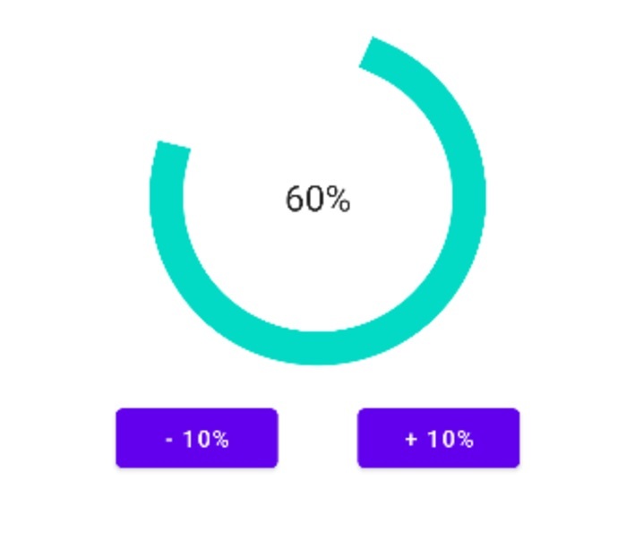
结论
本文提供了在 Android 中创建圆形确定性进度条的直接教程。它阐明了圆形确定性进度条是一种可视化元素,它以圆形框架的形式显示任务的进度。与不确定的进度条不同,确定性进度条显示了明确的进度值。本文详细介绍了实际实现此进度条的步骤,包括创建 XML 格式的文件以及通过 Java 代码自定义其行为。此外,还提供了测试 XML 和 Java 代码片段以供参考。总而言之,本文指出了如何帮助设计师在 Android 应用程序中创建外观精美且功能强大的进度条。

