
如何使用 CSS clip-path 创建三角形
cssweb developmentfront end technology更新于 2024/5/16 6:04:17
我们可以使用 CSS clip-path 属性创建三角形。
语法
CSS clip-path 属性的语法如下 −
Selector {
   clip-path: /*value*/
}
示例
以下示例演示了 CSS clip-path 属性。
<!DOCTYPE html>
<html>
   <head>
      <style>
         div {
            padding: 10%;
            border-radius: 2%;
            width: 10%;
            box-shadow: inset 0 0 80px violet;
            clip-path: polygon(50% 0, 100% 100%, 0% 100%);
         }
      </style>
   </head>
   <body>
      <div></div>
   </body>
</html>
这将给出以下输出
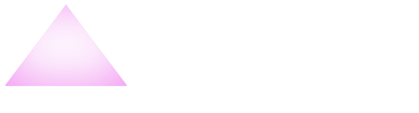
示例
<!DOCTYPE html>
<html>
   <head>
      <style>
         div {
            display: flex;
            margin: 10px 0 20px;
         }
         div > div {
            height: 12px;
            border-top: 40px ridge orange;
            border-right: 20px solid white;
            border-bottom: 60px ridge cornflowerblue;
            border-left: 80px solid white;
         }
      </style>
   </head>
   <body>
      <div>
         <div></div>
      </div>
   </body>
</html>
这将给出以下输出

相关文章
有用资源
css 参考教程 - 该教程包含有关 css 的更多信息:https://www.cainiaomax.com/css/