
如何使用 Material UI 在 ReactJS 中创建暗黑模式?
我们将学习如何使用 Material UI 库在 ReactJS 中创建暗黑模式。Material UI 是一个外部 React 库,它提供了设计好的 React 组件,我们可以通过从库中导入这些组件直接在 React 项目中使用。
世界上大多数用户喜欢暗黑模式,只有少数用户喜欢亮白模式。暗黑模式有助于减少访客的视觉疲劳,让页面看起来更奢华。因此,我们应该允许用户根据自己的喜好选择暗黑模式或亮白模式。
在原生 JavaScript 或 JQuery 中,我们可以通过添加和删除暗黑主题的类来创建暗黑模式和亮白模式。在 React 中,我们可以使用 Material-Ui 等外部库在应用程序中实现暗黑模式。
用户需要在 React 项目中安装 Material-Ui 库,然后才能开始。在终端中执行以下命令。
npm install @mui/material @emotion/react @emotion/styled
语法
用户可以按照以下语法使用 ReactJS 的 Material-Ui 库创建暗黑模式。
const darkTheme = createTheme({
    palette: {
    mode: "dark",
    },
});
<ThemeProvider theme={darkTheme}>
<CssBaseline />
</ThemeProvider>
在上述语法中,我们使用了 Material-Ui 中的 ThemeProvider 组件,并将 darkTheme 对象作为 ThemeProvider 组件的 prop 传递。此外,我们需要使用 CssBaseline 组件来应用暗黑主题的 CSS;否则,它将无法正常工作。
示例 1
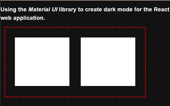
在下面的示例中,我们从 Material UI 库中导入了 ThemeProvider 组件和 createTheme 构造函数。之后,我们使用 createTheme() 构造函数创建了深色主题。
我们需要将组件的内容绑定到 ThemeProvider 组件中,并将主题对象作为 ThemeProvider 组件的 prop 传递。在输出中,用户可以观察到深色主题。
import { ThemeProvider, createTheme } from "@mui/mater/styles;
import CssBaseline from "@mui/material/CssBaseline";

const theme = createTheme({
   palette: {
      mode: "dark",
   },
});

function App() {
   const divStyle = {
      display: "flex",
      flexDireciton: "row",
      textAlign: "center",
      border: "5px dotted red",
      width: "600px",
      height: "300px",
      marginLeft: "1rem",
      padding: "1rem",
   };
   const ChildDivStyle = {
      height: "80%",
      width: "45%",
      margin: "1.5rem",
      backgroundColor: "White",
   };
   return (
      <ThemeProvider theme={theme}>
         <CssBaseline />
         <div>
            <h2>
               {" "}
               Using the <i> Material UI </i> library to create dark mode for the
               React web application. {" "}
            </h2>
            <div style = {divStyle}>
               <div style = {ChildDivStyle}> </div>
               <div style = {ChildDivStyle}> </div>
            </div>
         </div>
      </ThemeProvider>
   );
}
export default App;
输出
示例 2 的步骤
用户可以按照以下步骤创建示例 2。
步骤 1 − 从 Material-Ui 库导入 ThemeProvider、CreateTheme 和 CSSBaseline。
步骤 2 − 现在,使用 ThemeProvider 组件并绑定其他组件以应用主题。
步骤 3 − 接下来,创建一个按钮来切换主题。当用户点击该按钮时,应该调用 handleThemeChange() 函数。
步骤 4 − 现在,设置主题的变量。我们将根据"themeLight"变量的布尔值选择明暗主题。
步骤 5 - 使用 createTheme() 构造函数根据 themeLight 变量的值创建主题。对于条件主题,我们可以使用三元运算符。
步骤 6 - 接下来,还要实现 handleThemeChange() 函数。在 handleThemeChange() 函数中,更改 themeLight 变量的值以在明暗主题之间切换。
示例 2
在下面的示例中,我们使用 Material-Ui 库将暗暗主题应用于 React 应用程序。当用户点击按钮时,主题会从明暗主题切换为暗暗主题,或从暗暗主题切换为明暗主题。
import { ThemeProvider, createTheme } from "@mui/material/styles";
import CssBaseline from "@mui/material/CssBaseline";
import React from "react";
import { useState } from "react";

function App() {
   const [themeLight, setThemeType] = useState(true);
   const theme = createTheme({
      palette: {
         mode: themeLight ? "light" : "dark",
      },
   });
   function handleThemeChange() {
      setThemeType(!themeLight);
   }
   const divStyle = {
      textAlign: "center",
      border: "5px solid green",
      width: "500px",
      height: "400px",
      marginLeft: "1rem",
      padding: "1rem",
      fontSize: "1.2rem",
      color: "blue,",
   };
   const buttonStyle = {
      width: "15rem",
      height: "2rem",
      borderRadius: "10px",
      border: "1px solid green",
      backgroundColor: "darkGrey",
      fontSize: "1.5rem",
      padding: "2px",
      marginLeft: "1rem",
   };
   return (
      <ThemeProvider theme={theme}>
         <CssBaseline />
         <div>
            <h2>
               {" "}
               Using the <i> Material UI </i> library to create dark mode for the
               React web application. {" "}
            </h2>
            <h3> Use the button to toggle the theme. </h3>
            <div style = {divStyle}>
               <p>This is the content of the Div! </p>
               <p>This is another content of the Div! </p>
               <p>This is the test text of the Div! </p>
               <p>This is the last line of the Div! </p>
            </div>
         </div>
         <br></br>
         <button style = {buttonStyle} onClick = {handleThemeChange}>
           Change Theme
         </button>
      </ThemeProvider>
   );
}
export default App;
输出
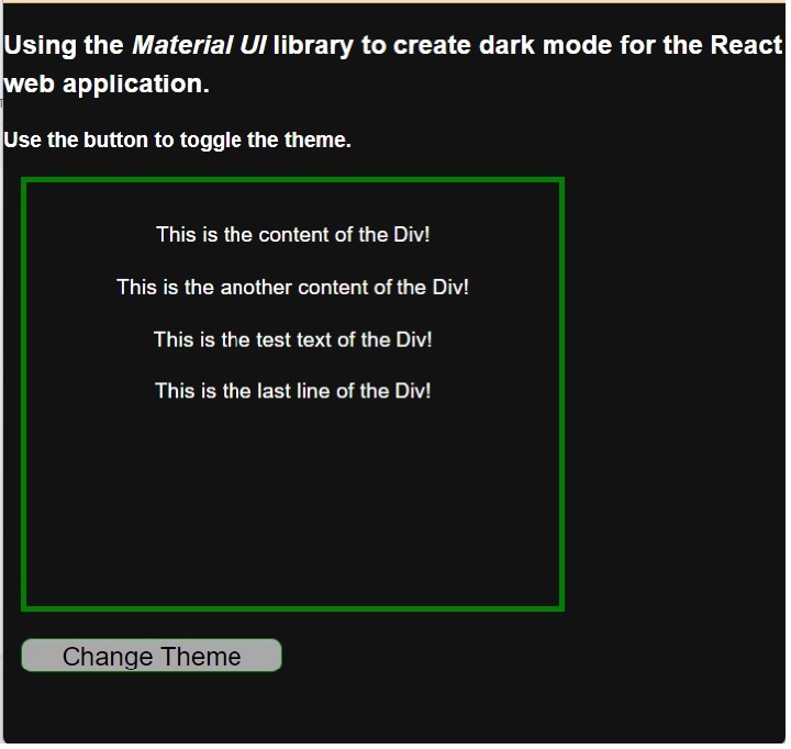
用户学习了如何使用 Material UI 库在暗色模式和亮色模式之间切换。用户可以在示例输出中观察到,当我们从亮色模式切换到暗色模式时,Material UI 会更改字体颜色和背景。这意味着它会更改我们未定义样式的 HTML 元素的 CSS,并且即使我们在任何 HTML 元素上应用了 CSS,它也会保持不变。

