
如何使用 CSS 创建不同设备(智能手机、平板电脑和笔记本电脑)的外观?
cssweb developmentfront end technology更新于 2025/12/8 6:04:17
要使用 CSS 创建不同设备的外观,代码如下 −
示例
<!DOCTYPE html>
<html>
<head>
<meta name="viewport" content="width=device-width, initial-scale=1">
<style>
   .mobileDevice {
      position: relative;
      width: 360px;
      height: 400px;
      margin: auto;
      border: 16px rgb(7, 80, 35) solid;
      border-top-width: 60px;
      border-bottom-width: 60px;
      border-radius: 36px;
   }
   .mobileDevice:after {
      content: '';
      display: block;
      width: 35px;
      height: 35px;
      position: absolute;
      left: 50%;
      bottom: -65px;
      transform: translate(-50%, -50%);
      background: #333;
      border-radius: 50%;
      border:2px solid rgb(200, 255, 0);
   }
   .mobileDevice .screen {
      width: 360px;
      height: 400px;
      background: white;
   }
</style>
</head>
<body>
<h1 style="text-align: center;">Device look example </h1>
<div class="mobileDevice">
<div class="screen">
<iframe src="https://wikipedia.org/" style="width:100%;border:none;height:100%" />
</div>
</div>
</body>
</html>
输出
上述代码将产生以下输出 −
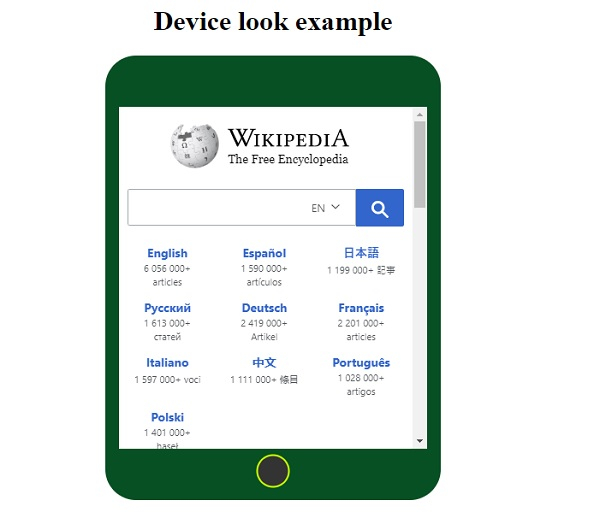
相关文章
有用资源
css 参考教程 - 该教程包含有关 css 的更多信息:https://www.cainiaomax.com/css/

