
CSS 中的 @media 规则
cssweb developmentfront end technology更新于 2025/1/19 2:52:17
CSS @media 规则用于在单个样式表中为不同的媒体类型(例如打印、屏幕、全部等)指定不同的样式。它通常后跟以逗号分隔的媒体类型列表,以及包含目标媒体样式规则的 CSS 声明块。
语法
以下是语法 −
@media not | only mediatype and (expressions) {
   CSS-Code;
}
示例
让我们看一个 CSS @media 规则的例子 −
<!DOCTYPE html>
<html>
<head>
<meta name="viewport" content="width=device-width, initial-scale=1">
<style>
* {
   box-sizing: border-box;
}
.col {
   float: left;
   width: 20%;
   padding: 40px;
}
body {
   background-color: lemonchiffon;
   margin: 20px;
}
@media screen and (max-width: 850px) {
   .col {
      width: 50%;
   }
   body {
      background-color: mediumseagreen;
   }
}
@media screen and (max-width: 550px) {
   .col {
      width: 100%;
   }
   body {
      background-color: powderblue;
   }
}
</style>
</head>
<body>
<div class="row">
<div class="col" style="background-color:#373;"> </div>
<div class="col" style="background-color:#363;"> </div>
<div class="col" style="background-color:#353;"> </div>
<div class="col" style="background-color:#343;"> </div>
<div class="col" style="background-color:#333;"> </div>
</div>
</body>
</html>
输出
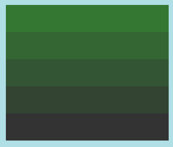
这将产生以下输出 −
当屏幕尺寸大于 850px 时 −

当屏幕尺寸介于 550px 和 850px 之间时 −

当屏幕尺寸小于 550px 时 −
示例
我们来看另一个 CSS @media 规则的示例 −
<!DOCTYPE html>
<html>
<head>
<style type="text/css">
p {
   background-origin: content-box;
   background-repeat: no-repeat;
   background-size: cover;
   box-shadow: 0 0 3px black;
   padding: 20px;
   background-origin: border-box;
}
@media screen and (max-width: 900px) {
   p{
      background: url("https://www.cainiaomax.com/swing/images/swing.jpg");
      color: #c303c3;
   }
}
@media screen and (max-width: 500px) {
   p {
      color: black;
      background: url("https://www.cainiaomax.com/cplusplus/images/cplusplus.jpg");
   }
}
</style>
</head>
<body>
<p>This is demo text. This is demo text. This is demo text. This is demo text.
This is demo text. This is demo text. This is demo text. This is demo text.
This is demo text. This is demo text. This is demo text. This is demo text.
This is demo text. This is demo text. This is demo text. This is demo text.
This is demo text. This is demo text. This is demo text. This is demo text.
This is demo text. </p>
</body>
</html>
输出
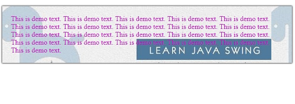
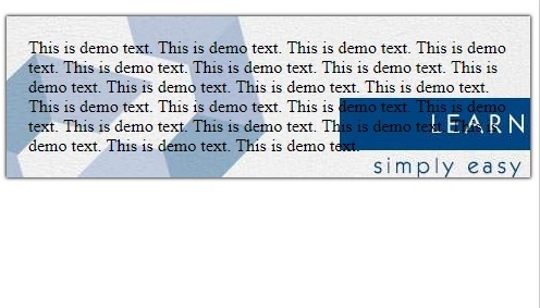
这将产生以下输出 −
当屏幕尺寸大于 500px 时 −
当屏幕尺寸小于 500px 时 −
相关文章
有用资源
css 参考教程 - 该教程包含有关 css 的更多信息:https://www.cainiaomax.com/css/

