
理解 CSS 单位
cssweb developmentfront end technology更新于 2025/1/7 3:56:17
CSS 单位有多种类别,例如字体大小、字符大小、视口尺寸等。广义上讲,有绝对单位和相对单位两大类,它们由上述子类别组成。
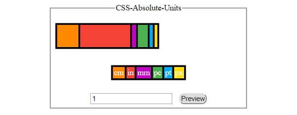
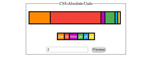
以下是 CSS 绝对单位 −
| Sr.No | Unit &名称 |
|---|---|
| 1 | cm 厘米 (1 cm = 100 mm) |
| 2 | in 英寸 (1 in = 2.54 cm) |
| 3 | mm 毫米 |
| 4 | pc 派卡 (1 pc = 12 pt) |
| 5 | pt 点 (1 pt = 1/72 in) |
| 6 | px 像素 (1 px = 0.75 pt) |
让我们看一个 CSS 绝对单位的示例 −
示例
<!DOCTYPE html>
<html>
<head>
<title>CSS Absolute Units</title>
<style>
form {
   width:70%;
   margin: 0 auto;
   text-align: center;
}
* {
   padding: 2px;
   margin:5px;
}
input[type="button"] {
   border-radius: 10px;
}
#container {
   display: flex;
}
.child{
   margin: 5px 0;
   height: 40px;
   color: white;
   border-width: 4px 0 4px 4px;
   border-color: black;
   border-style: solid;
}
.child:nth-of-type(1){
   background-color: #FF8A00;
   width:1cm;
}
.child:nth-of-type(2){
   background-color: #F44336;
   width:1in;
}
.child:nth-of-type(3){
   background-color: #C303C3;
   width:1mm;
}
.child:nth-of-type(4){
background-color: #4CAF50;
width:1pc;
}
.child:nth-of-type(5){
   background-color: #03A9F4;
   width:1pt;
}
.child:nth-of-type(6){
   background-color: #FEDC11;
   width:1px;
   border-right-width: 4px;
}
</style>
</head>
<body>
<form>
<fieldset>
<legend>CSS-Absolute-Units</legend>
<div id="container">
<div class="child"></div>
<div class="child"></div>
<div class="child"></div>
<div class="child"></div>
<div class="child"></div>
<div class="child"></div>
</div><br>
<div><span class="child">cm</span><span class="child">in</span><span class="child">mm</span><span class="child">pc</span><span class="child">pt</span><span class="child">px</span></div><br>
<input type="number" id="numSelect" value="1" min="1">
<input type="button" onclick="changeWidth()" value="Preview">
<script>
var numSelect = document.getElementById("numSelect");
function changeWidth() {
   var divChild = document.getElementsByClassName('child');
   for(var i=0; i<6; i++){
      divChild[i].style.width = numSelect.value+divChild[i+6].textContent;
}}
</script>
</body>
</html>
输出
点击任何按钮前 −
点击‘预览’按钮后,数值字段设置为 −
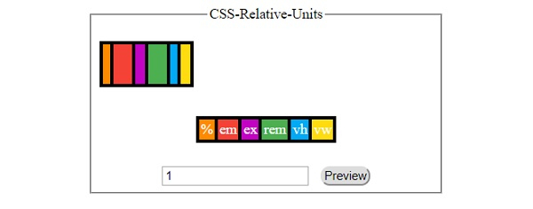
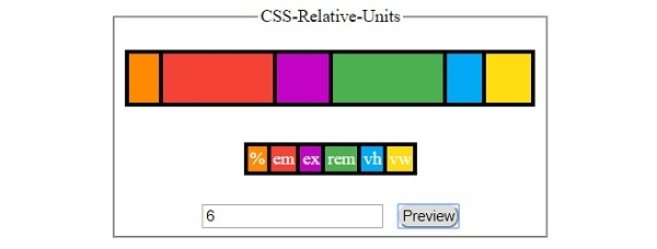
以下是 CSS 相对单位 −
| Sr.No | 单位 &相对于 |
|---|---|
| 1 | % 父元素尺寸 |
| 2 | em 元素的字体大小 |
| 3 | ex 元素字体的 x 高度 |
| 4 | rem 根元素的字体大小 |
| 5 | vh 视口高度的 1% |
| 6 | vmax 比视口大 1%尺寸 |
| 7 | vmin 视口较小尺寸的 1% |
| 8 | vw 视口宽度的 1% |
让我们看一个 CSS 相对单位的示例 −
示例
<!DOCTYPE html>
<html>
<head>
<title>CSS Relative Units</title>
<style>
form {
   width:70%;
   margin: 0 auto;
   text-align: center;
}
* {
   padding: 2px;
   margin:5px;
}
input[type="button"] {
   border-radius: 10px;
}
#container {
   display: flex;
}
.child{
   margin: 5px 0;
   height: 40px;
   color: white;
   border-width: 4px 0 4px 4px;
   border-color: black;
   border-style: solid;
}
.child:nth-of-type(1){
   background-color: #FF8A00;
   width:1%;
}
.child:nth-of-type(2){
   background-color: #F44336;
   width:1em;
}
.child:nth-of-type(3){
   background-color: #C303C3;
   width:1ex;
}
.child:nth-of-type(4){
   background-color: #4CAF50;
   width:1rem;
}
.child:nth-of-type(5){
   background-color: #03A9F4;
   width:1vh;
}
.child:nth-of-type(6){
   background-color: #FEDC11;
   width:1vw;
   border-right-width: 4px;
}
</style>
</head>
<body>
<form>
<fieldset>
<legend>CSS-Relative-Units</legend>
<div id="container">
<div class="child"></div>
<div class="child"></div>
<div class="child"></div>
<div class="child"></div>
<div class="child"></div>
<div class="child"></div>
</div><br>
<div><span class="child">%</span><span class="child">em</span><span class="child">ex</span><span class="child">rem</span><span class="child">vh</span><span class="child">vw</span></div><br>
<input type="number" id="numSelect" value="1" min="1">
<input type="button" onclick="changeWidth()" value="Preview">
<script>
var numSelect = document.getElementById("numSelect");
function changeWidth() {
   var divChild = document.getElementsByClassName('child');
   for(var i=0; i<6; i++){
      divChild[i].style.width = numSelect.value+divChild[i+6].textContent;
}}
</script>
</body>
</html>
输出
点击任何按钮之前 −
点击 ‘Preview’ 按钮后,选中 ‘em’ 选项并清空文本字段 −
相关文章
有用资源
css 参考教程 - 该教程包含有关 css 的更多信息:https://www.cainiaomax.com/css/

