
使用 CSS 显示内联块元素
cssweb developmentfront end technology更新于 2025/1/14 6:04:17
CSS 的 Display 属性值为 inline-block,会根据内容的宽度或提供的宽度(取较大者)来渲染元素,在父元素的宽度被充分利用之前,它不会强制换行。
语法
以下是 CSS 显示内联块元素的语法 −
Selector {
   display: inline-block;
}
示例
让我们看一个 CSS display inline-block 的例子 −
<!DOCTYPE html>
<html>
<head>
<title>CSS Display Inline-Block</title>
<style>
form {
   width:70%;
   margin: 0 auto;
   text-align: center;
}
* {
   padding: 2px;
   margin:5px;
   box-sizing: border-box;
}
input[type="button"] {
   border-radius: 10px;
}
.child{
   display: inline-block;
   height: 40px;
   width: 40px;
   color: white;
   border: 4px solid black;
}
.child:nth-of-type(1){
   background-color: #FF8A00;
}
.child:nth-of-type(2){
   background-color: #F44336;
}
.child:nth-of-type(3){
   background-color: #C303C3;
}
.child:nth-of-type(4){
   background-color: #4CAF50;
}
.child:nth-of-type(5){
   background-color: #03A9F4;
}
.child:nth-of-type(6){
   background-color: #FEDC11;
}
</style>
</head>
<body>
<form>
<fieldset>
<legend>CSS-Display-Inline-Block</legend>
<div id="container">
<div class="child"></div><div class="child"></div><div class="child"></div><div class="child"></div><div class="child"></div><div class="child"></div>
</div><br>
</body>
</html>
输出
这将产生以下输出 −
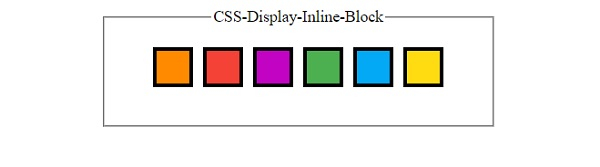
示例
让我们看另一个 CSS Display inline-block 的例子 −
<!DOCTYPE html>
<html>
<head>
<style>
#flex {
   display: flex;
}
#none {
   display: none;
}
.inline-block {
   display: inline-block;
   background-color: mintcream;
}
.grid {
   display: grid;
   background-color: cornflowerblue;
}
div {
   margin: 30px;
   padding: 5px;
   height: 10px;
   line-height: 5px;
   text-align: center;
   background-color: lightblue;
   border: 2px solid black;
}
div > div {
   background-color: lightpink;
   border: 2px solid green;
}
div > div > div {
   background-color: sandybrown;
   border: 2px solid darkred;
}
</style>
</head>
<body>
<div><span id="flex">One</span>
<div><span id="none">Two</span>
<div>
<span class="inline-block">Three</span>
<span class="inline-block">Four</span>
<div>
<span class="grid">Five</span>
<span class="grid">Six</span>
</div>
</div>
</div>
</div>
</body>
</html>
输出
这将产生以下输出 −
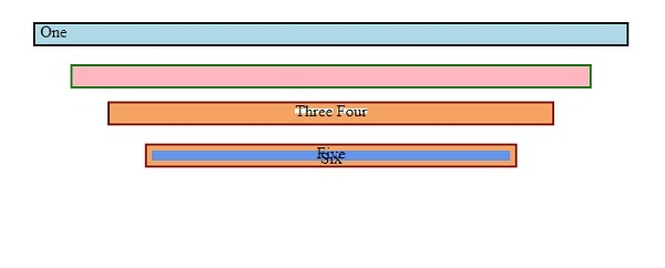
相关文章
有用资源
css 参考教程 - 该教程包含有关 css 的更多信息:https://www.cainiaomax.com/css/

