
如何在Python中组合多个图
pythonserver side programmingprogramming更新于 2026/2/15 15:08:17
简介
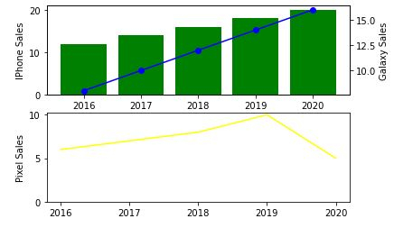
Matplotlib 允许您在同一图表中添加多个绘图。在本教程中,我将向您展示如何在同一图中的两个不同轴上呈现数据。
如何做..
1 通过打开 Python 命令提示符并触发 pip Install Matplotlib 来安装 Matplotlib。
import matplotlib.pyplot as plt
2.准备要显示的数据。
import matplotlib.pyplot as plt

# 数据准备(我编造的数据在这些统计数据中不准确)
mobile = ['Iphone','Galaxy','Pixel']

# 4 个季度的移动设备销售数据(单位:百万)
units_sold = (('2016',12,8,6),
('2017',14,10,7),
('2018',16,12,8),
('2019',18,14,10),
('2020',20,16,5),)
3.将数据拆分为每个公司移动单元的数组。
# 数据准备 - 分割数据
Years, IPhone_Sales, Galaxy_Sales, Pixel_Sales = zip(*units_sold)

# 设置位置
Position = list(range(len(units_sold)))

# 设置宽度
Width = 0.2
4.创建第一个子图。
plt.subplot(2, 1, 1)
<matplotlib.axes._subplots.AxesSubplot at 0x214185d4e50>
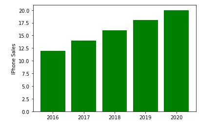
5.创建一个包含 iPhone_Sales 信息的条形图。
Iphone = plt.bar(Position, IPhone_Sales,color='green')
plt.ylabel('IPhone Sales')
plt.xticks(Position, Years)
([<matplotlib.axis.XTick at 0x214186115e0>,
<matplotlib.axis.XTick at 0x21418611580>,
<matplotlib.axis.XTick at 0x2141861fc40>,
<matplotlib.axis.XTick at 0x21418654e20>,
<matplotlib.axis.XTick at 0x2141865f370>],
[Text(0, 0, '2016'),
Text(0, 0, '2017'),
Text(0, 0, '2018'),
Text(0, 0, '2019'),
Text(0, 0, '2020')])
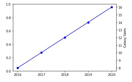
6.现在创建另一个 y 轴以添加有关 Samsung Galaxy 销售的信息。
plt.twinx()
Galaxy = plt.plot(Position, Galaxy_Sales, 'o-', color='blue')
plt.ylabel('Galaxy Sales')
plt.xticks(Position, Years)
([<matplotlib.axis.XTick at 0x214186b4c40>,
<matplotlib.axis.XTick at 0x214186b4c10>,
<matplotlib.axis.XTick at 0x21418682ac0>,
<matplotlib.axis.XTick at 0x214186dd8e0>,
<matplotlib.axis.XTick at 0x214186dddf0>],
[Text(0, 0, '2016'),
Text(0, 0, '2017'),
Text(0, 0, '2018'),
Text(0, 0, '2019'),
Text(0, 0, '2020')])
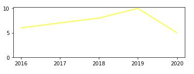
7.我们现在将绘制最终的 Google Pixel 销售额。
plt.subplot(2, 1, 2)
plt.plot(Position, Pixel_Sales, color='yellow')
plt.gca().set_ylim(ymin=0)
plt.xticks(Position, Years)
([<matplotlib.axis.XTick at 0x2141870f9a0>,
<matplotlib.axis.XTick at 0x2141870f580>,
<matplotlib.axis.XTick at 0x2141870a730>,
<matplotlib.axis.XTick at 0x2141873c9d0>,
<matplotlib.axis.XTick at 0x2141873cee0>],
[Text(0, 0, '2016'),
Text(0, 0, '2017'),
Text(0, 0, '2018'),
Text(0, 0, '2019'),
Text(0, 0, '2020')])
plt.show()
示例
8.将它们放在一起并保存图表。
import matplotlib.pyplot as plt

# 数据准备(我编造的数据在这些统计数据中不准确)
mobile = ['Iphone','Galaxy','Pixel']

# 4 个季度的移动设备销售数据(单位:百万)
units_sold = (('2016',12,8,6),
('2017',14,10,7),
('2018',16,12,8),
('2019',18,14,10),
('2020',20,16,5),)
# data prep - splitting the data
Years, IPhone_Sales, Galaxy_Sales, Pixel_Sales = zip(*units_sold)

# 设置位置
Position = list(range(len(units_sold)))

# 设置宽度
Width = 0.2

plt.subplot(2, 1, 1)
Iphone = plt.bar(Position, IPhone_Sales,color='green')
plt.ylabel('IPhone Sales')
plt.xticks(Position, Years)

plt.twinx()
Galaxy = plt.plot(Position, Galaxy_Sales, 'o-', color='blue')
plt.ylabel('Galaxy Sales')
plt.xticks(Position, Years)

plt.subplot(2, 1, 2)
plt.plot(Position, Pixel_Sales, color='yellow')
plt.ylabel('Pixel Sales')
plt.gca().set_ylim(ymin=0)
plt.xticks(Position, Years)

# plt.show()
plt.savefig('CombiningGraphs.png', dpi=72)
相关文章
有用资源
python 参考教程 - 该教程包含有关 python 的更多信息:https://www.cainiaomax.com/python/

