
如何使用 Python Matplotlib 绘制饼图,其中单个饼图突出显示?
pythonserver side programmingprogramming更新于 2026/2/15 21:00:17
简介..
您最喜欢的图表类型是什么?如果您向管理层或业务分析师提出这个问题,立即回答是饼图!。这是表示百分比的一种非常常见的方式。
如何操作..
1.通过以下命令安装 matplotlib。
pip install matplotlib
2.导入 matplotlib
import matplotlib.pyplot as plt
3.准备临时数据。
tennis_stats = (('Federer', 20),('Nadal', 20),('Djokovic', 17),('Murray', 3),)
4.下一步是准备数据。
titles = [title for player, title in tennis_stats]
players = [player for player, title in tennis_stats]
5.创建饼图,将值作为标题,将标签作为球员姓名。
autopct 参数 - 格式化值,使其显示为精确到小数点后一位的百分比。axis('equals') - 确保饼图看起来是圆形的。.show - 显示结果图。
注意-执行 .show 会阻止程序的执行。关闭窗口后,程序将恢复。
plt.pie(titles, labels=players, autopct='%1.1f%%')
plt.gca().axis('equal')
(-1.1000000175619362,
1.1000000072592333,
-1.1090350248729983,
1.100430247887797)
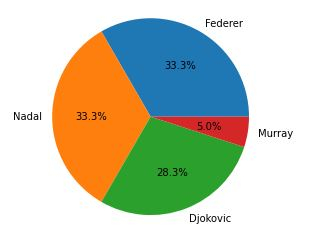
6.显示图表。
plt.show()
7. 有几个有趣的参数可以用于操作饼图。 startangle - 旋转楔形/饼形的起点。
counterclock - 您想要设置的方向,默认为 True。
plt.pie(titles, labels=players, startangle=60, counterclock=False,autopct='%1.1f%%')
plt.show()
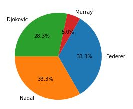
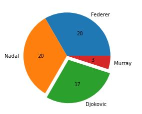
8.现在对于像我这样的一些人来说,百分比毫无意义。请记住,输出图会发送给那些不知道代码深处隐藏的值的人。因此,我们是否可以显示实际标题,而不是百分比(从饼图的分割方式来看,百分比显然是不言而喻的)。
嗯,这有点棘手,因为您需要编写自定义函数。请看下文。
我将创建一个自定义函数 - format_values,以百分比作为键创建一个字典,以便我们可以检索引用的值。
示例
from matplotlib.ticker import FuncFormatter
total = sum(title for player, title in tennis_stats)
print(total)
values = {int(100 * title / total): title for player, title in tennis_stats}
print(values)

def format_values(percent, **kwargs):
value = values[int(percent)]
return '{}'.format(value)

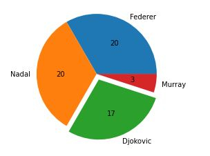
# 爆炸以分离饼图/楔形图。
explode = (0, 0, 0.1, 0.0)
plt.pie(titles, labels=players,explode=explode, autopct=format_values)

plt.show()

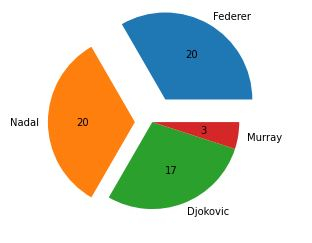
# 值越大,分离越远。
explode = (0.3, 0.2, 0.0, 0.0)
plt.pie(titles, labels=players, explode=explode, autopct=format_values)
60
{33: 20, 28: 17, 5: 3}
([<matplotlib.patches.Wedge at 0x2279cf8dd00>,
<matplotlib.patches.Wedge at 0x2279cf9b1f0>,
<matplotlib.patches.Wedge at 0x2279cf9b8b0>,
<matplotlib.patches.Wedge at 0x2279cf9bf70>],
[Text(0.6999999621611965, 1.2124355871444568, 'Federer'),
Text(-1.2999999999999945, -1.2171478395895002e-07, 'Nadal'),
Text(0.39420486628845763, -1.0269384223966398, 'Djokovic'),
Text(1.086457194390738, -0.17207778693546258, 'Murray')],
[Text(0.44999997567505484, 0.7794228774500078, '20'),
Text(-0.7999999999999966, -7.490140551320001e-08, '20'),
Text(0.2150208361573405, -0.5601482303981671, '17'),
Text(0.5926130151222206, -0.09386061105570685, '3')])
Finally, putting everything together.
示例
# imports
import matplotlib.pyplot as plt
from matplotlib.ticker import FuncFormatter

# 准备数据
tennis_stats = (('Federer', 20),('Nadal', 20),('Djokovic', 17),('Murray', 3),)

titles = [title for player, title in tennis_stats]
players = [player for player, title in tennis_stats]

total = sum(title for player, title in tennis_stats)
values = {int(100 * title / total): title for player, title in tennis_stats}

# 自定义函数
def format_values(percent, **kwargs):
value = values[int(percent)]
return '{}'.format(value)

# 展开以分离饼图/楔形图。
explode = (0, 0, 0.1, 0.0)
plt.pie(titles, labels=players, explode=explode, autopct=format_values)

plt.show()
相关文章
有用资源
python 参考教程 - 该教程包含有关 python 的更多信息:https://www.cainiaomax.com/python/

