Flutter - 布局简介
由于 Flutter 的核心概念是 一切都是 widget,Flutter 将用户界面布局功能融入到 widget 本身。Flutter 提供了大量专门设计的 widget,如 Container、Center、Align 等,仅用于布局用户界面。通过组合其他 widget 构建的 widget 通常使用布局 widget。让我们在本章中学习 Flutter 布局概念。
布局小部件的类型
布局小部件可以根据其子部件分为两个不同的类别 −
- 支持单个子部件的小部件
- 支持多个子部件的小部件
让我们在接下来的部分中学习这两种类型的小部件及其功能。
单个子部件
在此类别中,小部件将只有一个小部件作为其子部件,并且每个小部件都具有特殊的布局功能。
例如,Center 小部件仅将其子部件相对于其父部件居中,而Container 小部件提供了完全的灵活性,可以使用不同的选项(如填充、装饰等)将其子部件放置在其中的任何给定位置,
单个子部件小部件是创建具有单一功能(如按钮、标签等)的高质量小部件的绝佳选择,
使用 Container 小部件创建简单按钮的代码如下 −
class MyButton extends StatelessWidget {
   MyButton({Key key}) : super(key: key);

   @override
   Widget build(BuildContext context) {
      return Container(
         decoration: const BoxDecoration(
            border: Border(
               top: BorderSide(width: 1.0, color: Color(0xFFFFFFFFFF)),
               left: BorderSide(width: 1.0, color: Color(0xFFFFFFFFFF)),
               right: BorderSide(width: 1.0, color: Color(0xFFFF000000)),
               bottom: BorderSide(width: 1.0, color: Color(0xFFFF000000)),
            ),
         ),
         child: Container(
            padding: const
            EdgeInsets.symmetric(horizontal: 20.0, vertical: 2.0),
            decoration: const BoxDecoration(
               border: Border(
                  top: BorderSide(width: 1.0, color: Color(0xFFFFDFDFDF)),
                  left: BorderSide(width: 1.0, color: Color(0xFFFFDFDFDF)),
                  right: BorderSide(width: 1.0, color: Color(0xFFFF7F7F7F)),
                  bottom: BorderSide(width: 1.0, color: Color(0xFFFF7F7F7F)),
               ),
               color: Colors.grey,
            ),
            child: const Text(
               'OK',textAlign: TextAlign.center, style: TextStyle(color: Colors.black)
            ),
         ),
      );
   }
}
在这里,我们使用了两个小部件 - 一个 Container 小部件和一个 Text 小部件。小部件的结果是一个自定义按钮,如下所示 −
让我们检查一下 Flutter 提供的一些最重要的单子布局小部件 −
Padding − 用于通过给定的填充排列其子小部件。这里,填充可以由 EdgeInsets 类提供。
Align − 使用 alignment 属性的值将其子小部件在其自身内对齐。alignment 属性的值可以由 FractionalOffset 类提供。 FractionalOffset 类指定与左上角的距离的偏移量。
偏移量的一些可能值如下 −
FractionalOffset(1.0, 0.0) 表示右上角。
FractionalOffset(0.0, 1.0) 表示左下角。
下面显示了有关偏移量的示例代码 −
Center(
   child: Container(
      height: 100.0,
      width: 100.0,
      color: Colors.yellow, child: Align(
         alignment: FractionalOffset(0.2, 0.6),
         child: Container( height: 40.0, width:
            40.0, color: Colors.red,
         ),
      ),
   ),
)
FittedBox − 它会缩放子窗口小部件,然后根据指定的适合度对其进行定位。
AspectRatio −它尝试将子窗口小部件的大小调整为指定的纵横比
ConstrainedBox
Baseline
FractinallySizedBox
IntrinsicHeight
IntrinsicWidth
LiimitedBox
OffStage
OverflowBox
SizedBox
SizedOverflowBox
Transform
CustomSingleChildLayout
我们的 hello world 应用程序正在使用基于材质的布局窗口小部件来设计主页。让我们修改我们的 hello world 应用程序,使用如下所示的基本布局小部件构建主页 −
容器 − 通用、单子、基于框的容器小部件,具有对齐、填充、边框和边距以及丰富的样式功能。
居中 − 简单、单子容器小部件,将其子小部件居中。
修改后的MyHomePage和MyApp小部件的代码如下 −
class MyApp extends StatelessWidget {
   @override
   Widget build(BuildContext context) {
      return MyHomePage(title: "Hello World demo app");
   }
}
class MyHomePage extends StatelessWidget {
   MyHomePage({Key key, this.title}) : super(key: key);
   final String title;
   @override
   Widget build(BuildContext context) {
      return Container(
         decoration: BoxDecoration(color: Colors.white,),
         padding: EdgeInsets.all(25), child: Center(
            child:Text(
               'Hello World', style: TextStyle(
                  color: Colors.black, letterSpacing: 0.5, fontSize: 20,
               ),
               textDirection: TextDirection.ltr,
            ),
         )
      );
   }
}
此处,
Container 小部件是顶级或根小部件。Container 使用 decoration 和 padding 属性进行配置,以布局其内容。
BoxDecoration 具有许多属性,如颜色、边框等,用于装饰 Container 小部件,此处,color 用于设置容器的颜色。
Container 小部件的 padding 通过使用 dgeInsets 类进行设置,该类提供指定 padding 值的选项。
Center 是 Container 小部件的子小部件。同样,Text 是 Center 小部件的子部件。 Text 用于显示消息,Center 用于使文本消息相对于父窗口小部件 Container 居中。
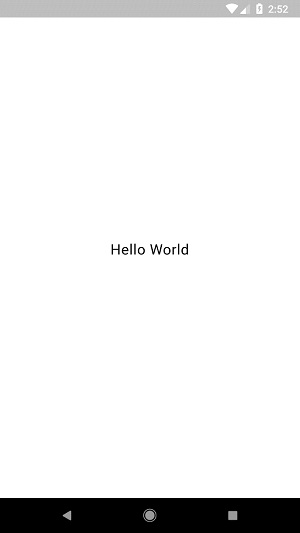
上述代码的最终结果是一个布局示例,如下所示 −
多个子窗口小部件
在此类别中,给定窗口小部件将具有多个子窗口小部件,并且每个窗口小部件的布局都是唯一的。
例如,Row 窗口小部件允许其子窗口小部件在水平方向上布局,而 Column 窗口小部件允许其子窗口小部件在垂直方向上布局。通过组合 Row 和 Column,可以构建具有任何复杂程度的窗口小部件。
让我们在本节中学习一些常用的窗口小部件。
Row − 允许以水平方式排列其子项。
Column − 允许以垂直方式排列其子项。
ListView − 允许将其子项排列为列表。
GridView − 允许将其子项排列为图库。
Expanded −用于使 Row 和 Column 小部件的子项占据最大可能的区域。
Table − 基于 Table 的小部件。
Flow − 基于 Flow 的小部件。
Stack −基于堆栈的小部件。
高级布局应用程序
在本节中,让我们学习如何使用单个和多个子布局小部件创建自定义设计的复杂产品列表用户界面。
为此,请按照下面给出的顺序 −
在 Android Studio 中创建一个新的 Flutter 应用程序 product_layout_app。
用以下代码替换 main.dart 代码 −
import 'package:flutter/material.dart';
void main() => runApp(MyApp());

class MyApp extends StatelessWidget {
   // 此小部件是您的应用程序的根。
   @override
   Widget build(BuildContext context) {
      return MaterialApp(
         title: 'Flutter Demo', theme: ThemeData(
         primarySwatch: Colors.blue,),
         home: MyHomePage(title: 'Product layout demo home page'),
      );
   }
}
class MyHomePage extends StatelessWidget {
   MyHomePage({Key key, this.title}) : super(key: key);
   final String title;

   @override
   Widget build(BuildContext context) {
      return Scaffold(
         appBar: AppBar(title: Text(this.title),),
         body: Center(child: Text( 'Hello World', )),
      );
   }
}
这里,
我们通过扩展 StatelessWidget 而不是默认的 StatefulWidget 创建了 MyHomePage 小部件,然后删除了相关代码。
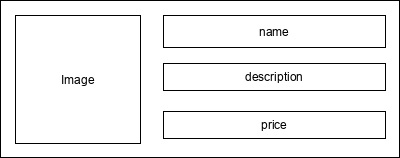
现在,根据指定的设计创建一个新的小部件 ProductBox,如下所示 −
ProductBox 的代码如下。
class ProductBox extends StatelessWidget {
   ProductBox({Key key, this.name, this.description, this.price, this.image})
      : super(key: key);
   final String name;
   final String description;
   final int price;
   final String image;

   Widget build(BuildContext context) {
      return Container(
         padding: EdgeInsets.all(2), height: 120,  child: Card(
            child: Row(
               mainAxisAlignment: MainAxisAlignment.spaceEvenly, children: <Widget>[
                  Image.asset("assets/appimages/" +image), Expanded(
                     child: Container(
                        padding: EdgeInsets.all(5), child: Column(
                           mainAxisAlignment: MainAxisAlignment.spaceEvenly,
                              children: <Widget>[

                              Text(this.name, style: TextStyle(fontWeight:
                                 FontWeight.bold)), Text(this.description),
                              Text("Price: " + this.price.toString()),
                           ],
                        )
                     )
                  )
               ]
            )
         )
      );
   }
}
请注意代码中的以下内容 −
ProductBox 使用了下面指定的四个参数 −
name - 产品名称
description - 产品说明
price - 产品价格
image - 产品图片
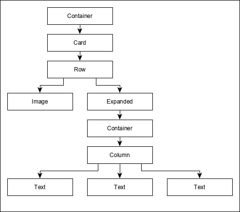
ProductBox 使用下面指定的七个内置小部件 −
- 容器
- 展开
- 行
- 列
- 卡片
- 文本
- 图像
ProductBox 是使用上面提到的小部件设计的。小部件的排列或层次结构在下面显示的图中指定 −
现在,在应用程序的资产文件夹中放置一些用于产品信息的虚拟图像(见下文),并在 pubspec.yaml 文件中配置资产文件夹,如下所示−
assets:
   - assets/appimages/floppy.png
   - assets/appimages/iphone.png
   - assets/appimages/laptop.png
   - assets/appimages/pendrive.png
   - assets/appimages/pixel.png
   - assets/appimages/tablet.png
iPhone.png
Pixel.png
Laptop.png
Tablet.png
Pendrive.png

Floppy.png
最后,使用 MyHomePage 小部件中的 ProductBox 小部件,如下所示 −
class MyHomePage extends StatelessWidget {
   MyHomePage({Key key, this.title}) : super(key: key);
   final String title;

   @override
   Widget build(BuildContext context) {
      return Scaffold(
         appBar: AppBar(title:Text("Product Listing")),
         body: ListView(
            shrinkWrap: true, padding: const EdgeInsets.fromLTRB(2.0, 10.0, 2.0, 10.0),
            children: <Widget> [
               ProductBox(
                  name: "iPhone",
                  description: "iPhone is the stylist phone ever",
                  price: 1000,
                  image: "iphone.png"
               ),
               ProductBox(
                  name: "Pixel",
                  description: "Pixel is the most featureful phone ever",
                  price: 800,
                  image: "pixel.png"
               ),
               ProductBox(
                  name: "Laptop",
                  description: "Laptop is most productive development tool",
                  price: 2000,
                  image: "laptop.png"
               ),
               ProductBox(
                  name: "Tablet",
                  description: "Tablet is the most useful device ever for meeting",
                  price: 1500,
                  image: "tablet.png"
               ),
               ProductBox(
                  name: "Pendrive",
                  description: "Pendrive is useful storage medium",
                  price: 100,
                  image: "pendrive.png"
               ),
               ProductBox(
                  name: "Floppy Drive",
                  description: "Floppy drive is useful rescue storage medium",
                  price: 20,
                  image: "floppy.png"
               ),
            ],
         )
      );
   }
}
这里,我们使用 ProductBox 作为 ListView 小部件的子项。
产品布局应用程序 (product_layout_app) 的完整代码 (main.dart) 如下 −
import 'package:flutter/material.dart';
void main() => runApp(MyApp());

class MyApp extends StatelessWidget {
   // 此小部件是您的应用程序的根。
   @override
   Widget build(BuildContext context) {
      return MaterialApp(
         title: 'Flutter Demo', theme: ThemeData(
            primarySwatch: Colors.blue,
         ),
         home: MyHomePage(title: 'Product layout demo home page'),
      );
   }
}
class MyHomePage extends StatelessWidget {
   MyHomePage({Key key, this.title}) : super(key: key);
   final String title;

   @override
   Widget build(BuildContext context) {
      return Scaffold(
         appBar: AppBar(title: Text("Product Listing")),
         body: ListView(
            shrinkWrap: true,
            padding: const EdgeInsets.fromLTRB(2.0, 10.0, 2.0, 10.0),
            children: <Widget>[
               ProductBox(
                  name: "iPhone",
                  description: "iPhone is the stylist phone ever",
                  price: 1000,
                  image: "iphone.png"
               ),
               ProductBox(
                  name: "Pixel",
                  description: "Pixel is the most featureful phone ever",
                  price: 800,
                  image: "pixel.png"
               ),
               ProductBox(
                  name: "Laptop",
                  description: "Laptop is most productive development tool",
                  price: 2000,
                  image: "laptop.png"
               ),
               ProductBox(
                  name: "Tablet",
                  description: "Tablet is the most useful device ever for meeting",
                  price: 1500,
                  image: "tablet.png"
               ),
               ProductBox(
                  name: "Pendrive",
                  description: "Pendrive is useful storage medium",
                  price: 100,
                  image: "pendrive.png"
               ),
               ProductBox(
                  name: "Floppy Drive",
                  description: "Floppy drive is useful rescue storage medium",
                  price: 20,
                  image: "floppy.png"
               ),
            ],
         )
      );
   }
}
class ProductBox extends StatelessWidget {
   ProductBox({Key key, this.name, this.description, this.price, this.image}) :
      super(key: key);
   final String name;
   final String description;
   final int price;
   final String image;

   Widget build(BuildContext context) {
      return Container(
         padding: EdgeInsets.all(2),
         height: 120,
         child: Card(
            child: Row(
               mainAxisAlignment: MainAxisAlignment.spaceEvenly,
               children: <Widget>[
                  Image.asset("assets/appimages/" + image),
                  Expanded(
                     child: Container(
                        padding: EdgeInsets.all(5),
                        child: Column(
                           mainAxisAlignment: MainAxisAlignment.spaceEvenly,
                           children: <Widget>[
                              Text(
                                 this.name, style: TextStyle(
                                    fontWeight: FontWeight.bold
                                 )
                              ),
                              Text(this.description), Text(
                                 "Price: " + this.price.toString()
                              ),
                           ],
                        )
                     )
                  )
               ]
            )
         )
      );
   }
}
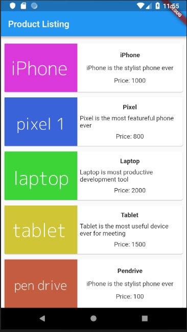
应用程序的最终输出如下−