
GWT - 自定义小部件
GWT 提供了三种创建自定义用户界面元素的方法。有三种常规策略可供遵循 −
通过扩展 Composite 类创建小部件 − 这是创建自定义小部件最常见、最简单的方法。在这里,您可以使用现有小部件创建具有自定义属性的复合视图。
使用 JAVA 中的 GWT DOM API 创建小部件 − GWT 基本小部件就是以这种方式创建的。但这仍然是一种非常复杂的创建自定义小部件的方法,应谨慎使用。
使用 JavaScript 并使用 JSNI 将其包装在小部件中 − 这通常只应作为最后的手段。考虑到本机方法的跨浏览器影响,它变得非常复杂,并且调试起来也更加困难。
使用复合类创建自定义小部件
此示例将带您完成简单的步骤,展示如何在 GWT 中创建自定义小部件。按照以下步骤更新我们在 GWT - Basic Widgets 一章中创建的 GWT 应用程序 −
在这里,我们将通过扩展 Composite 类来创建自定义小部件,这是构建自定义小部件的最简单方法。
| 步骤 | 描述 |
|---|---|
| 1 | 在 com.tutorialspoint 包下创建一个名为 HelloWorld 的项目,如 GWT - Create Application 一章中所述。 |
| 2 | 修改 HelloWorld.gwt.xml, HelloWorld.css、HelloWorld.html 和 HelloWorld.java 如下所述。其余文件保持不变。 |
| 3 | 编译并运行应用程序以验证实施逻辑的结果。 |
以下是修改后的模块描述符 src/com.tutorialspoint/HelloWorld.gwt.xml 的内容。
<?xml version = "1.0" encoding = "UTF-8"?>
<module rename-to = 'helloworld'>
   <!-- Inherit the core Web Toolkit stuff.                        -->
   <inherits name = 'com.google.gwt.user.User'/>

   <!-- Inherit the default GWT style sheet.                       -->
   <inherits name = 'com.google.gwt.user.theme.clean.Clean'/>

   <!-- Specify the app entry point class.                         -->
   <entry-point class = 'com.tutorialspoint.client.HelloWorld'/>

   <!-- Specify the paths for translatable code                    -->
   <source path = 'client'/>
   <source path = 'shared'/>

</module>
以下是修改后的样式表文件war/HelloWorld.css的内容。
body {
   text-align: center;
   font-family: verdana, sans-serif;
}

h1 {
   font-size: 2em;
   font-weight: bold;
   color: #777777;
   margin: 40px 0px 70px;
   text-align: center;
}
以下是修改后的 HTML 主机文件 war/HelloWorld.html 的内容。
<html>
   <head>
      <title>Hello World</title>
      <link rel = "stylesheet" href = "HelloWorld.css"/>
      <script language = "javascript" src = "helloworld/helloworld.nocache.js">
      </script>
   </head>

   <body>
      <h1>Custom Widget Demonstration</h1>
      <div id = "gwtContainer"></div>
   </body>
</html>
让我们来看看 Java 文件 src/com.tutorialspoint/HelloWorld.java 的以下内容,它将演示如何创建自定义小部件。
package com.tutorialspoint.client;

import com.google.gwt.core.client.EntryPoint;
import com.google.gwt.event.dom.client.ClickEvent;
import com.google.gwt.event.dom.client.ClickHandler;
import com.google.gwt.user.client.ui.CheckBox;
import com.google.gwt.user.client.ui.Composite;
import com.google.gwt.user.client.ui.HorizontalPanel;
import com.google.gwt.user.client.ui.RootPanel;
import com.google.gwt.user.client.ui.TextBox;

public class HelloWorld implements EntryPoint {

   /**
    * A composite of a TextBox and a CheckBox that optionally enables it.
    */
   private static class OptionalTextBox extends Composite implements
   ClickHandler {

      private TextBox textBox = new TextBox();
      private CheckBox checkBox = new CheckBox();
      private boolean enabled = true;

      public boolean isEnabled() {
         return enabled;
      }

      public void setEnabled(boolean enabled) {
         this.enabled = enabled;
      }

      /**
       * Style this widget using .optionalTextWidget CSS class.<br/>
       * Style textbox using .optionalTextBox CSS class.<br/>
       * Style checkbox using .optionalCheckBox CSS class.<br/>
       * Constructs an OptionalTextBox with the given caption
       * on the check.
       * @param caption the caption to be displayed with the check box
       */
      public OptionalTextBox(String caption) {
         // 使用垂直面板将复选框放置在文本框上方。
         HorizontalPanel panel = new HorizontalPanel();
         // panel.setBorderWidth(1);
         panel.setSpacing(10);
         panel.add(checkBox);
         panel.add(textBox);

         // 所有复合体都必须在其构造函数中调用 initWidget()。
         initWidget(panel);

         //设置整个小部件的样式名称
         setStyleName("optionalTextWidget");

         //设置文本框的样式名称
         textBox.setStyleName("optionalTextBox");

         //设置复选框的样式名称
         checkBox.setStyleName("optionalCheckBox");
         textBox.setWidth("200");

         // 设置复选框的标题,并默认选中。
         checkBox.setText(caption);
         checkBox.setValue(enabled);
         checkBox.addClickHandler(this);
         enableTextBox(enabled,checkBox.getValue());
      }

      public void onClick(ClickEvent event) {
         if (event.getSource() == checkBox) {
            // When the check box is clicked,
            //update the text box's enabled state.
            enableTextBox(enabled,checkBox.getValue());
         }
      }

      private void enableTextBox(boolean enable,boolean isChecked){
         enable = (enable && isChecked) || (!enable && !isChecked);
         textBox.setStyleDependentName("disabled", !enable);
         textBox.setEnabled(enable);
      }
   }

   public void onModuleLoad() {
      // 创建一个可选文本框并将其添加到根面板。
      OptionalTextBox otb = new OptionalTextBox(
         "Want to explain the solution?");
      otb.setEnabled(true);
      RootPanel.get().add(otb);
   }
}
完成所有更改后,让我们像在 GWT - 创建应用程序 一章中一样,在开发模式下编译并运行应用程序。如果您的应用程序一切正常,则将产生以下结果 −
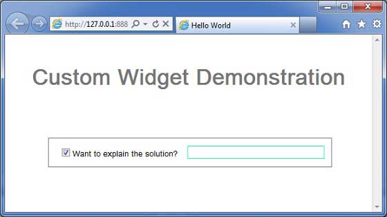
您可以注意到以下几点
通过扩展 Composite 小部件创建自定义小部件非常简单。
我们使用 GWT 内置小部件、TextBox 和 CheckBox 创建了一个小部件,从而使用了可重用性的概念。
根据复选框的状态,TextBox 被禁用/启用。我们提供了一个 API 来启用/禁用该控件。
我们通过记录的 CSS 样式公开了内部小部件样式。

