Plotly - 热图
热图(或热图)是数据的图形表示,其中矩阵中包含的各个值以颜色表示。热图的主要目的是更好地可视化数据集内的位置/事件量,并帮助引导查看者查看最重要的数据可视化区域。
由于热图依赖颜色来传达值,因此可能最常用于显示更通用的数值视图。热图在吸引人们关注趋势方面非常灵活且有效,正是由于这些原因,它们在分析界越来越受欢迎。
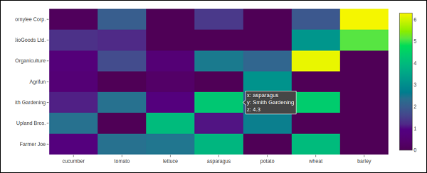
热图天生就不言自明。阴影越深,数量越大(值越高,分散越紧密,等等)。Plotly 的 graph_objects 模块包含 Heatmap() 函数。它需要 x、y 和 z 属性。它们的值可以是列表、numpy 数组或 Pandas 数据框。
在下面的例子中,我们有一个 2D 列表或数组,它定义了数据(不同农民每年收获的吨数)以进行颜色编码。然后,我们还需要两个农民姓名和他们种植的蔬菜的列表。
vegetables = [
   "cucumber",
   "tomato",
   "lettuce",
   "asparagus",
   "potato",
   "wheat",
   "barley"
]
farmers = [
   "Farmer Joe",
   "Upland Bros.",
   "Smith Gardening",
   "Agrifun",
   "Organiculture",
   "BioGoods Ltd.",
   "Cornylee Corp."
]
harvest = np.array(
   [
      [0.8, 2.4, 2.5, 3.9, 0.0, 4.0, 0.0],
      [2.4, 0.0, 4.0, 1.0, 2.7, 0.0, 0.0],
      [1.1, 2.4, 0.8, 4.3, 1.9, 4.4, 0.0],
      [0.6, 0.0, 0.3, 0.0, 3.1, 0.0, 0.0],
      [0.7, 1.7, 0.6, 2.6, 2.2, 6.2, 0.0],
      [1.3, 1.2, 0.0, 0.0, 0.0, 3.2, 5.1],
      [0.1, 2.0, 0.0, 1.4, 0.0, 1.9, 6.3]
   ]
)
trace = go.Heatmap(
   x = vegetables,
   y = farmers,
   z = harvest,
   type = 'heatmap',
   colorscale = 'Viridis'
)
data = [trace]
fig = go.Figure(data = data)
iplot(fig)
上述代码的输出如下:−