使用 pcolor 在 matplotlib 中创建热图
matplotlibserver side programmingprogramming更新于 2025/11/21 22:12:00
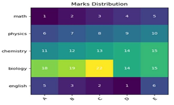
首先,我们可以使用 imshow 方法创建一个图像,并获取一个收获矩阵。之后,我们可以用一些值标记这些图像像素。
步骤
创建一个科目列表。
创建一个学生列表。
创建一个收获矩阵。
使用 subplots 方法创建 fig 和 ax 变量,其中默认 nrows 和 ncols 为 1。
使用步骤 1 的数据将数据显示为图像,即在 2D 常规栅格上。
获取或设置 X 轴的当前刻度位置和标签,长度为学生。
获取或设置 Y 轴的当前刻度位置和标签,长度为科目。
设置网格的 X 轴刻度标签,学生。
设置网格的 Y 轴刻度标签,带有主题。
设置艺术家对象的属性,包括 rotation、ha 和 rotation_mode="anchor"。
使用 text 方法向图中添加文本。
使用 set_title() 方法为轴设置标题。
要显示图形,请使用 plt.show() 方法。
示例
import numpy as np
import matplotlib.pyplot as plt

subjects = ["math", "physics", "chemistry", "biology", "english"]
students = ["A", "B", "C", "D", "E"]

harvest = np.array([
   [1, 2, 3, 4, 5],
   [6, 7, 8, 9, 10],
   [11, 12, 13, 14, 15],
   [18, 19, 22, 14, 15],
   [5, 3, 2, 1, 6]
])
fig, ax = plt.subplots()
im = ax.imshow(harvest)

ax.set_xticks(np.arange(len(students)))
ax.set_yticks(np.arange(len(subjects)))

ax.set_xticklabels(students)
ax.set_yticklabels(subjects)

plt.setp(ax.get_xticklabels(), rotation=45, ha="right", rotation_mode="anchor")

for i in range(len(subjects)):
   for j in range(len(students)):
      text = ax.text(j, i, harvest[i, j], ha="center", va="center", color="w")

ax.set_title("Marks Distribution")

plt.show()
输出