
DC.js - 热图
热图是以地图形式对数据进行图形化表示,其中数据值以颜色表示。本章详细介绍了热图。
在继续绘制热图之前,我们应该了解 dc.heatMap 类及其方法。dc.heatMap 使用 mixins 来实现绘制图表的基本功能,这些功能列在下面 −
- dc.colorMixin
- dc.marginMixin
- dc.baseMixin
dc.heatMap 的完整类图如下 −
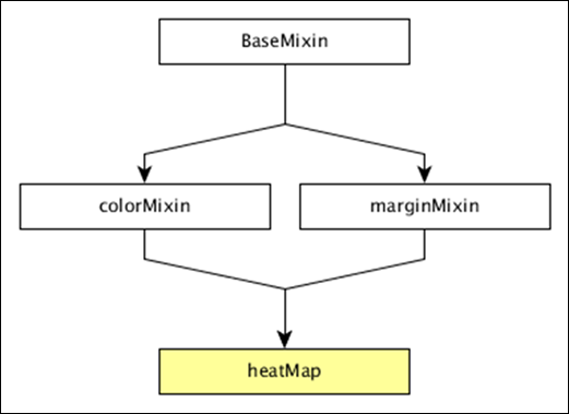
dc.heatMap 获得了上述 mixins 的所有方法。它有自己的方法来绘制热图,下面将对此进行解释 −
boxOnClick( [handler])
此方法用于在热图中单击单个单元格时获取或设置处理程序。
cols( [cols])
此方法用于获取或设置创建热图列的键。
colsLabel( [label])
此方法用于获取或设置列标签,以列名表示。类似地,我们也可以执行行标签。
rows( [rows])
此方法用于获取或设置用于创建热图行的值。
xAxisOnClick( [handler])
当在 x 轴上单击列标记时,此方法用于获取或设置处理程序。
xBorderRadius( [border])
此方法用于设置 X 边框半径。如果将值设置为 0,则将获得完整的矩形。
绘制热图
让我们在 DC 中绘制热图。为此,我们需要遵循下面给出的步骤 −
步骤 1:定义变量
让我们定义一个变量,如下所示 −
var chart = dc.heatMap('#heatmap');
此处,heatMap 函数与 id heatmap 映射。
步骤 2:读取数据
从 howell1.csv 文件中读取数据,如下所示 −
d3.csv("data/howell1.csv", function(errors, people) {
   var mycrossfilter = crossfilter(people);
}
在这里,我们使用了相同的 howell1.csv 文件,它如下所示 −
"height","weight","age","male"
151.765,47.8256065,63,1
139.7,36.4858065,63,0
136.525,31.864838,65,0
156.845,53.0419145,41,1
145.415,41.276872,51,0
163.83,62.992589,35,1
149.225,38.2434755,32,0
168.91,55.4799715,27,1
147.955,34.869885,19,0
165.1,54.487739,54,1
154.305,49.89512,47,0

......................
......................
步骤 3:获取记录
让我们使用下面给出的编码来获取记录 −
people.forEach(function(x) {
   x.age = Math.floor(x.age) + 1;
   x.heightRange = Math.floor(x.height / 10) + 1;
   x.weightRange = Math.floor(x.weight / 10) + 1;
   if(x.male == 1) {
      x.gender = 1;
   } else {
      x.gender = 2;
   }
});
在这里,我们检查了性别,并使用上述公式设置了 x 轴的高度和宽度范围。
步骤 4:设置维度
您可以使用下面给出的编码 − 设置维度
var ageDimension = mycrossfilter.dimension(function(data) {
    return [+data.gender, +data.heightRange];
});
分配维度后,使用下面给出的编码 − 对性别进行分组
var genderGroup = genderDimension.group().reduceCount();
步骤 5:生成图表
现在,使用下面给出的编码生成热图 −
chart
   .width(20 * 45 + 80)
   .height(2 * 45 + 40)
   .dimension(ageDimension)
   .group(ageGroup)
   .keyAccessor(function(d) { return +d.key[1]; })
   .valueAccessor(function(d) { return +d.key[0]; })
   .colorAccessor(function(d) { return +d.value; })
   .title(function(d) {
      return "Height Range:   " + ((d.key[1] - 1) * 10) + " - " + (d.key[1] * 10) + "cm
" +
      "Gender:  " + (d.key[0] == 1 ? "Male" : "Female") + "
" +
      "Count: " + (d.value) + " count";
   })
   .calculateColorDomain()

chart.render();
});
这里,
- 我们将图表宽度指定为 20 × 45 + 80,高度指定为 2 × 45 + 40。
- 然后我们指定了性别维度和组。
- 键和值访问器从热图中返回键和值。
- 我们必须使用 colorAccessor() 函数返回颜色。
- 最后,设置标题并呈现图表。
第 6 步:工作示例
完整编码如下。创建一个网页 heatmap.html 并向其中添加以下更改。
<html>
   <head>
      <title>DC heat map Sample</title>
      <link rel = "stylesheet" type = "text/css" href = "css/bootstrap.css">
      <link rel = "stylesheet" type = "text/css" href = "css/dc.css"/>

      <script src = "js/d3.js"></script>
      <script src = "js/crossfilter.js"></script>
      <script src = "js/dc.js"></script>
   </head>

   <body>
      <div>
         <div id = "heatmap"></div>
      </div>

      <script language = "javascript">
         var chart = dc.heatMap('#heatmap');

         d3.csv("data/howell1.csv", function(errors, people) {
            var mycrossfilter = crossfilter(people);

            people.forEach(function(x) {
               x.age = Math.floor(x.age) + 1;
               x.heightRange = Math.floor(x.height / 10) + 1;
               x.weightRange = Math.floor(x.weight / 10) + 1;
               if(x.male == 1) {
                  x.gender = 1;
               } else {
                  x.gender = 2;
               }
            });

            var ageDimension = mycrossfilter.dimension(function(data) {
               return [+data.gender, +data.heightRange];
            });

            var ageGroup = ageDimension.group().reduceCount();
            chart
               .width(20 * 45 + 80)
               .height(2 * 45 + 40)
               .dimension(ageDimension)
               .group(ageGroup)
               .keyAccessor(function(d) { return +d.key[1]; })
               .valueAccessor(function(d) { return +d.key[0]; })
               .colorAccessor(function(d) { return +d.value; })
               .title(function(d) {
                  return "Height Range:   " + ((d.key[1] - 1) * 10) + " - " +
                  (d.key[1] * 10) + "cm
" +
                  "Gender:  " + (d.key[0] == 1 ? "Male" : "Female") + "
" +
                  "Count: " + (d.value) + " count";})
               .calculateColorDomain()

            chart.render();
         });
      </script>
   </body>
</html>
现在,请求浏览器,我们将看到以下响应。

