
Flex - TextInput 控件
简介
TextInput 控件是一个文本输入控件,允许用户输入和编辑一行统一格式的文本。
类声明
以下是 spark.components.TextArea 类的声明 −
public class TextInput
    extends SkinnableTextBase
公共属性
| Sr.No | 属性 &描述 |
|---|---|
| 1 | widthInChars : Number 控件的默认宽度,以 em 为单位。 |
公共方法
| Sr.No | 方法 &描述 |
|---|---|
| 1 | TextInput() 构造函数。 |
继承的方法
此类从以下类继承方法 −
- spark.components.supportClasses.SkinnableTextBase
- spark.components.supportClasses.SkinnableComponent
- mx.core.UIComponent
- mx.core.FlexSprite
- flash.display.Sprite
- flash.display.DisplayObjectContainer
- flash.display.InteractiveObject
- flash.display.DisplayObject
- flash.events.EventDispatcher
- Object
Flex TextInput 控件示例
让我们按照以下步骤通过创建测试应用程序 − 来检查 Flex 应用程序中 TextInput 控件的使用情况 −
| 步骤 | 描述 |
|---|---|
| 1 | 按照 Flex - 创建应用程序 一章中的说明,在 com.tutorialspoint.client 包下创建一个名为 HelloWorld 的项目。 |
| 2 | 按照下文说明修改 HelloWorld.mxml。其余文件保持不变。 |
| 3 | 编译并运行应用程序以确保业务逻辑按要求运行。 |
以下是修改后的 mxml 文件 src/com.tutorialspoint/HelloWorld.mxml 的内容。
<?xml version = "1.0" encoding = "utf-8"?>
<s:Application xmlns:fx = "http://ns.adobe.com/mxml/2009"
   xmlns:s = "library://ns.adobe.com/flex/spark"
   xmlns:mx = "library://ns.adobe.com/flex/mx"
   width = "100%" height = "100%" minWidth = "500" minHeight = "500">

   <fx:Style source = "/com/tutorialspoint/client/Style.css" />
   <s:BorderContainer width = "550" height = "400" id = "mainContainer"
      styleName = "container">

      <s:VGroup width = "100%" height = "100%" gap = "50"
         horizontalAlign = "center" verticalAlign = "middle">
         <s:Label id = "lblHeader" text = "Form Controls Demonstration"
            fontSize = "40" color = "0x777777" styleName = "heading" />

         <s:Panel id = "textInputPanel" title = "Using TextInput"
            width = "420" height = "200" >
            <s:layout>
               <s:VerticalLayout  gap = "10"
                  verticalAlign = "middle" horizontalAlign = "center" />
            </s:layout>

            <s:TextInput text = "Hello World" />
            <s:TextInput text = "Hello World" enabled = "false" />
         </s:Panel>
      </s:VGroup>
   </s:BorderContainer>
</s:Application>
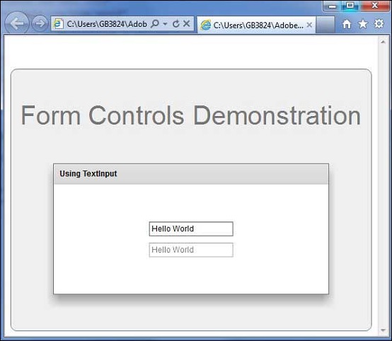
完成所有更改后,让我们像在 Flex - 创建应用程序 一章中一样,以正常模式编译并运行应用程序。如果您的应用程序一切正常,这将产生以下结果:[ 在线试用 ]
 flex_form_controls.html
