
Flexbox - 对齐内容
如果 flex-container 有多行(即 flex-wrap: wrap),align-content 属性将定义容器内每行的对齐方式。
用法 −
align-content: flex-start | flex-end | center | space-between | space-around | stretch;
此属性接受以下值 −
stretch − 内容中的行将拉伸以填满剩余空间。
flex-start − 内容中的所有行都打包在容器的开头。
flex-end −内容中的所有行都打包在容器的末尾。
center − 内容中的所有行都打包在容器的中心。
space-between − 额外的空间均匀分布在行之间。
space-around −额外的空间均匀分布在行之间,每行(包括第一行和最后一行)周围的空间相等。
center
将此值传递给属性 align-content 后,所有行都会排列在容器的中心。
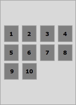
以下示例演示了将值 center 传递给 align-content 属性的结果。
<!doctype html>
<html lang = "en">
   <style>
      .box1{background:green;}
      .box2{background:blue;}
      .box3{background:red;}
      .box4{background:magenta;}
      .box5{background:yellow;}
      .box6{background:pink;}

      .box{
         font-size:25px;
         padding:15px;
         width:43%;
      }
      .container{
         display:flex;
         height:100vh;
         flex-wrap:wrap;
         align-content:center;
      }
   </style>

   <body>
      <div class = "container">
         <div class = "box box1">One</div>
         <div class = "box box2">two</div>
         <div class = "box box3">three</div>
         <div class = "box box4">four</div>
         <div class = "box box5">five</div>
         <div class = "box box6">six</div>
      </div>
   </body>
</html>
它将产生以下结果 −
flex-start
将此值传递给属性 align-content 后,所有行都将打包在容器的开头。
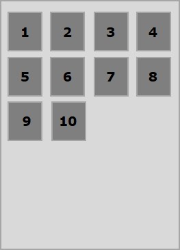
以下示例演示了将值 flex-start 传递给 align-content 属性的结果。
<!doctype html>
<html lang = "en">
   <style>
      .box1{background:green;}
      .box2{background:blue;}
      .box3{background:red;}
      .box4{background:magenta;}
      .box5{background:yellow;}
      .box6{background:pink;}

      .box{
         font-size:25px;
         padding:15px;
         width:40%;
      }
      .container{
         display:flex;
         height:100vh;
         flex-wrap:wrap;
         align-content:flex-start;
      }
   </style>

   <body>
      <div class = "container">
         <div class = "box box1">One</div>
         <div class = "box box2">two</div>
         <div class = "box box3">three</div>
         <div class = "box box4">four</div>
         <div class = "box box5">five</div>
         <div class = "box box6">six</div>
      </div>
   </body>
</html>
它将产生以下结果 −
flex-end
将此值传递给属性 align-content 后,所有行都会被打包到容器的末尾。
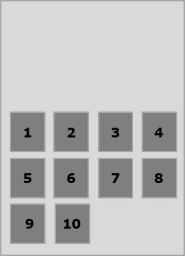
以下示例演示了将值 flex-end 传递给 align-content 属性的结果。
<!doctype html>
<html lang = "en">
   <style>
      .box1{background:green;}
      .box2{background:blue;}
      .box3{background:red;}
      .box4{background:magenta;}
      .box5{background:yellow;}
      .box6{background:pink;}

      .box{
         font-size:25px;
         padding:15px;
         width:40%;
      }
      .container{
         display:flex;
         height:100vh;
         flex-wrap:wrap;
         align-content:flex-end;
      }
   </style>

   <body>
      <div class = "container">
         <div class = "box box1">One</div>
         <div class = "box box2">two</div>
         <div class = "box box3">three</div>
         <div class = "box box4">four</div>
         <div class = "box box5">five</div>
         <div class = "box box6">six</div>
      </div>
   </body>
</html>
它将产生以下结果 −
stretch
将此值传递给属性 align-content 后,线条将拉伸以填满剩余空间。
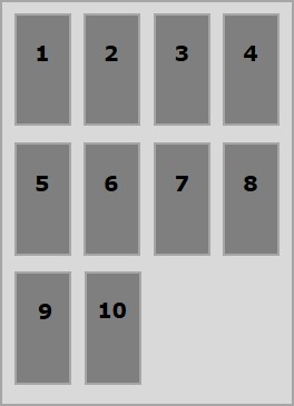
以下示例演示了将值 stretch 传递给 align-content 属性的结果。
<!doctype html>
<html lang = "en">
   <style>
      .box1{background:green;}
      .box2{background:blue;}
      .box3{background:red;}
      .box4{background:magenta;}
      .box5{background:yellow;}
      .box6{background:pink;}

      .box{
         font-size:25px;
         padding:15px;
         width:40;
      }
      .container{
         display:flex;
         height:100vh;
         flex-wrap:wrap;
         align-content:stretch;
      }
   </style>

   <body>
      <div class = "container">
         <div class = "box box1">One</div>
         <div class = "box box2">two</div>
         <div class = "box box3">three</div>
         <div class = "box box4">four</div>
         <div class = "box box5">five</div>
         <div class = "box box6">six</div>
      </div>
   </body>
</html>
它将产生以下结果 −
space-around
将此值传递给属性 align-content 后,额外的空间将均匀分布在行之间,每行周围的空间相等(包括第一行和最后一行)。
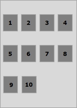
以下示例演示了将值 space-around 传递给 align-content 属性的结果。
<!doctype html>
<html lang = "en">
   <style>
      .box1{background:green;}
      .box2{background:blue;}
      .box3{background:red;}
      .box4{background:magenta;}
      .box5{background:yellow;}
      .box6{background:pink;}

      .box{
         font-size:25px;
         padding:15px;
         width:40%;
      }
      .container{
         display:flex;
         height:100vh;
         flex-wrap:wrap;
         align-content:space-around;
      }
   </style>

   <body>
      <div class = "container">
         <div class = "box box1">One</div>
         <div class = "box box2">two</div>
         <div class = "box box3">three</div>
         <div class = "box box4">four</div>
         <div class = "box box5">five</div>
         <div class = "box box6">six</div>
      </div>
   </body>
</html>
它将产生以下结果 −
space-between
将此值传递给属性 align-content 后,额外的空间将均匀分布在行之间,其中第一行将位于容器的顶部,最后一行将位于容器的底部。
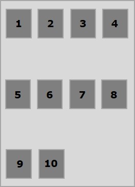
以下示例演示了将值 space-between 传递给 align-content 属性的结果。
<!doctype html>
<html lang = "en">
   <style>
      .box1{background:green;}
      .box2{background:blue;}
      .box3{background:red;}
      .box4{background:magenta;}
      .box5{background:yellow;}
      .box6{background:pink;}

      .box{
         font-size:25px;
         padding:15px;
         width:40%;
      }
      .container{
         display:flex;
         height:100vh;
         flex-wrap:wrap;
         align-content:space-between;
      }
   </style>

   <body>
      <div class = "container">
         <div class = "box box1">One</div>
         <div class = "box box2">two</div>
         <div class = "box box3">three</div>
         <div class = "box box4">four</div>
         <div class = "box box5">five</div>
         <div class = "box box6">six</div>
      </div>
   </body>
</html>
它将产生以下结果 −

