
Flexbox - Flex-Direction
flex-direction 属性用于指定需要放置弹性容器(flex-items)元素的方向。
用法 −
flex-direction: row | row-reverse | column | column-reverse
此属性接受四个值 −
row − 从左到右水平排列容器元素。
row-reverse − 从右到左水平排列容器元素。
column −从左到右垂直排列容器的元素。
column-reverse − 从右到左垂直排列容器的元素。
现在,我们将举几个例子来演示 direction 属性的使用。
row
将此值传递给 direction 属性后,容器的元素将按如下所示从左到右水平排列。
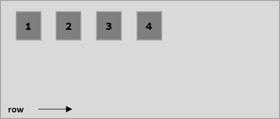
以下示例演示了将值 row 传递给 flex-direction 属性的结果。这里我们创建了六个不同颜色的框,其 flex-direction 值为 row。
<!doctype html>
<html lang = "en">
   <style>
      .box1{background:green;}
      .box2{background:blue;}
      .box3{background:red;}
      .box4{background:magenta;}
      .box5{background:yellow;}
      .box6{background:pink;}

      .box{
         font-size:35px;
         padding:15px;
      }
      .container{
         display:inline-flex;
         border:3px solid black;
         flex-direction:row;
      }
   </style>

   <body>
      <div class = "container">
         <div class = "box box1">One</div>
         <div class = "box box2">two</div>
         <div class = "box box3">three</div>
         <div class = "box box4">four</div>
         <div class = "box box5">five</div>
         <div class = "box box6">six</div>
      </div>
   </body>
</html>
它将产生以下结果 −
row-reverse
将此值传递给 direction 属性后,容器的元素将从右到左水平排列,如下所示。
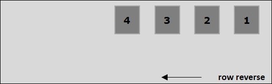
以下示例演示了将值 row-reverse 传递给 flex-direction 属性的结果。在这里,我们使用 flex-direction 值 row-reverse 创建六个具有不同颜色的框。
<!doctype html>
<html lang = "en">
   <style>
      .box1{background:green;}
      .box2{background:blue;}
      .box3{background:red;}
      .box4{background:magenta;}
      .box5{background:yellow;}
      .box6{background:pink;}

      .box{
         font-size:35px;
         padding:15px;
      }
      .container{
         display:inline-flex;
         border:3px solid black;
         flex-direction:row-reverse;
      }
   </style>

   <body>
      <div class = "container">
         <div class = "box box1">One</div>
         <div class = "box box2">two</div>
         <div class = "box box3">three</div>
         <div class = "box box4">four</div>
         <div class = "box box5">five</div>
         <div class = "box box6">six</div>
      </div>
   </body>
</html>
它将产生以下结果 −
column
将此值传递给 direction 属性后,容器的元素将从上到下垂直排列,如下所示。
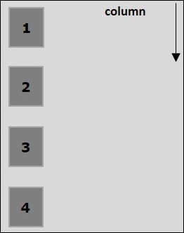
以下示例演示了将值 column 传递给 flex-direction 属性的结果。在这里,我们使用 flex-direction 值 column 创建六个具有不同颜色的框。
<!doctype html>
<html lang = "en">
   <style>
      .box1{background:green;}
      .box2{background:blue;}
      .box3{background:red;}
      .box4{background:magenta;}
      .box5{background:yellow;}
      .box6{background:pink;}

      .box{
         font-size:35px;
         padding:15px;
      }
      .container{
         display:inline-flex;
         border:3px solid black;
         flex-direction:column;
      }
   </style>
   <body>
      <div class = "container">
         <div class = "box box1">One</div>
         <div class = "box box2">two</div>
         <div class = "box box3">three</div>
         <div class = "box box4">four</div>
         <div class = "box box5">five</div>
         <div class = "box box6">six</div>
      </div>
   </body>
</html>
它将产生以下结果 −
column-reverse
将此值传递给 direction 属性后,容器的元素将从下到上垂直排列,如下所示。
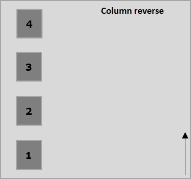
以下示例演示了将值 column-reverse 传递给 flex-direction 属性的结果。在这里,我们使用 flex-direction 值 column-reverse 创建六个具有不同颜色的框。
<!doctype html>
<html lang = "en">
   <style>
      .box1{background:green;}
      .box2{background:blue;}
      .box3{background:red;}
      .box4{background:magenta;}
      .box5{background:yellow;}
      .box6{background:pink;}

      .box{
         font-size:35px;
         padding:15px;
      }
      .container{
         display:inline-flex;
         border:3px solid black;
         flex-direction:column-reverse;
      }
   </style>

   <body>
      <div class = "container">
         <div class = "box box1">One</div>
         <div class = "box box2">two</div>
         <div class = "box box3">three</div>
         <div class = "box box4">four</div>
         <div class = "box box5">five</div>
         <div class = "box box6">six</div>
      </div>
   </body>
</html>
它将产生以下结果 −

