
Flexbox - 对齐内容
通常,在排列 flex 项目后,您可以观察到容器中剩余的额外空间,如下所示。
使用属性 justify-content,您可以按预期分配额外空间,从而沿主轴对齐内容。您还可以调整 flexitems 的对齐方式,以防它们溢出行。
用法 −
justify-content: flex-start | flex-end | center | space-between | space-around| space-evenly;
此属性接受以下值 −
flex-start − 弹性项目放置在容器的开始处。
flex-end − 弹性项目放置在容器的末尾。
center − 弹性项目放置在容器的中心,其中额外的空间均匀分布在弹性项目的开始和末尾。
space-between − 额外的空间均匀分布在弹性项目之间。
space-around −额外的空间在弹性项目之间均匀分布,使得容器边缘与其内容之间的空间是弹性项目之间空间的一半。
现在,我们将通过示例了解如何使用 justify-content 属性。
flex-start
将此值传递给属性 justify-content 后,弹性项目将放置在容器的开始处。
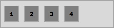
以下示例演示了将值 flex-start 传递给 justify-content 属性的结果。
<!doctype html>
<html lang = "en">
   <style>
      .box1{background:green;}
      .box2{background:blue;}
      .box3{background:red;}
      .box4{background:magenta;}
      .box5{background:yellow;}
      .box6{background:pink;}

      .box{
         font-size:35px;
         padding:15px;
      }
      .container{
         display:flex;
         border:3px solid black;
         justify-content:flex-start;
      }
   </style>

   <body>
      <div class = "container">
         <div class = "box box1">One</div>
         <div class = "box box2">two</div>
         <div class = "box box3">three</div>
         <div class = "box box4">four</div>
         <div class = "box box5">five</div>
         <div class = "box box6">six</div>
      </div>
   </body>
</html>
它将产生以下结果 −
flex-end
将此值传递给属性 justify-content 后,弹性项目将放置在容器的末尾。
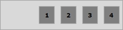
以下示例演示了将值 flex-end 传递给 justify-content 属性的结果。
<!doctype html>
<html lang = "en">
   <style>
      .box1{background:green;}
      .box2{background:blue;}
      .box3{background:red;}
      .box4{background:magenta;}
      .box5{background:yellow;}
      .box6{background:pink;}

      .box{
         font-size:35px;
         padding:15px;
      }
      .container{
         display:flex;
         border:3px solid black;
         justify-content:flex-end;
      }
   </style>

   <body>
      <div class = "container">
         <div class = "box box1">One</div>
         <div class = "box box2">two</div>
         <div class = "box box3">three</div>
         <div class = "box box4">four</div>
         <div class = "box box5">five</div>
         <div class = "box box6">six</div>
      </div>
   </body>
</html>
它将产生以下结果 −
center
将此值传递给属性 justify-content 后,弹性项目将放置在容器的中心,其中额外的空间均匀分布在弹性项目的开始和结束处。
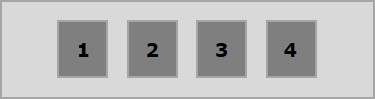
以下示例演示了将值 center 传递给 justify-content 属性的结果。
<!doctype html>
<html lang = "en">
   <style>
      .box1{background:green;}
      .box2{background:blue;}
      .box3{background:red;}
      .box4{background:magenta;}
      .box5{background:yellow;}
      .box6{background:pink;}

      .box{
         font-size:35px;
         padding:15px;
      }
      .container{
         display:flex;
         border:3px solid black;
         justify-content:center;
      }
   </style>

   <body>
      <div class = "container">
         <div class = "box box1">One</div>
         <div class = "box box2">two</div>
         <div class = "box box3">three</div>
         <div class = "box box4">four</div>
         <div class = "box box5">five</div>
         <div class = "box box6">six</div>
      </div>
   </body>
</html>
它将产生以下结果 −
space-between
将此值传递给属性 justify-content 后,额外的空间将在弹性项目之间平均分配,这样,任何两个弹性项目之间的空间都相同,并且弹性项目的开始和结束都接触容器的边缘。
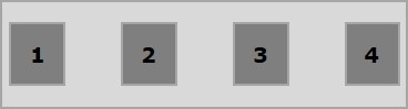
以下示例演示了将值 space-between 传递给 justify-content 属性的结果。
<!doctype html>
<html lang = "en">
   <style>
      .box1{background:green;}
      .box2{background:blue;}
      .box3{background:red;}
      .box4{background:magenta;}
      .box5{background:yellow;}
      .box6{background:pink;}

      .box{
         font-size:35px;
         padding:15px;
      }
      .container{
         display:flex;
         border:3px solid black;
         justify-content:space-between;
      }
   </style>

   <body>
      <div class = "container">
         <div class = "box box1">One</div>
         <div class = "box box2">two</div>
         <div class = "box box3">three</div>
         <div class = "box box4">four</div>
         <div class = "box box5">five</div>
         <div class = "box box6">six</div>
      </div>
   </body>
</html>
它将产生以下结果 −
space-around
将此值传递给属性 justify-content 后,额外的空间将在弹性项目之间平均分配,这样任何两个弹性项目之间的空间都是相同的。但是,容器边缘与其内容(弹性项目的开始和结束)之间的空间是弹性项目之间空间的一半。
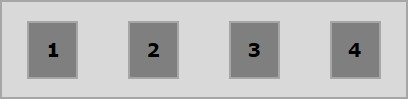
以下示例演示了将值 space-around 传递给 justify-content 属性的结果。
<!doctype html>
<html lang = "en">
   <style>
      .box1{background:green;}
      .box2{background:blue;}
      .box3{background:red;}
      .box4{background:magenta;}
      .box5{background:yellow;}
      .box6{background:pink;}

      .box{
         font-size:35px;
         padding:15px;
      }
      .container{
         display:flex;
         border:3px solid black;
         justify-content:space-around;
      }
   </style>

   <body>
      <div class = "container">
         <div class = "box box1">One</div>
         <div class = "box box2">two</div>
         <div class = "box box3">three</div>
         <div class = "box box4">four</div>
         <div class = "box box5">five</div>
         <div class = "box box6">six</div>
      </div>
   </body>
</html>
它将产生以下结果 −
space-evenly
将此值传递给属性 justify-content 后,额外的空间将在弹性项目之间平均分配,这样任何两个弹性项目之间的空间都是相同的(包括边缘的空间)。
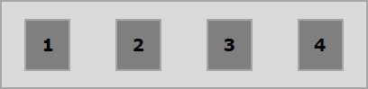
以下示例演示了将值 space-evenly 传递给 justify-content 属性的结果。
<!doctype html>
<html lang = "en">
   <style>
      .box1{background:green;}
      .box2{background:blue;}
      .box3{background:red;}
      .box4{background:magenta;}
      .box5{background:yellow;}
      .box6{background:pink;}

      .box{
         font-size:35px;
         padding:15px;
      }
      .container{
         display:flex;
         border:3px solid black;
         justify-content:space-evenly;
      }
   </style>

   <body>
      <div class = "container">
         <div class = "box box1">One</div>
         <div class = "box box2">two</div>
         <div class = "box box3">three</div>
         <div class = "box box4">four</div>
         <div class = "box box5">five</div>
         <div class = "box box6">six</div>
      </div>
   </body>
</html>
它将产生以下结果 −

