
Angular Material 7 - 单选按钮
<mat-radiobutton> 是一个 Angular 指令,用于 <input type="radio"> 以增强基于材料设计的样式。。
在本章中,我们将展示使用 Angular Material 绘制单选按钮控件所需的配置。
创建 Angular 应用程序
按照以下步骤更新我们在Angular 6 - 项目设置章节中创建的 Angular 应用程序 −
| 步骤 | 说明 |
|---|---|
| 1 | 创建一个名为 materialApp 的项目,如Angular 6 - 项目设置章节中所述。 |
| 2 | 修改 app.module.ts, app.component.ts, app.component.css 和 app.component.html,如下所述。 保持其余文件不变。 |
| 3 | 编译并运行应用程序以验证实现逻辑的结果。 |
以下是修改后的模块描述符app.module.ts的内容。
import { BrowserModule } from '@angular/platform-browser';
import { NgModule } from '@angular/core';
import { AppComponent } from './app.component';
import {BrowserAnimationsModule} from '@angular/platform-browser/animations';
import {MatRadioModule} from '@angular/material'
import {FormsModule, ReactiveFormsModule} from '@angular/forms';
@NgModule({
   declarations: [
      AppComponent
   ],
   imports: [
      BrowserModule,
      BrowserAnimationsModule,
      MatRadioModule,
      FormsModule,
      ReactiveFormsModule
   ],
   providers: [],
   bootstrap: [AppComponent]
})
export class AppModule { }
以下是修改后的CSS文件app.component.css的内容。
.tp-radio-group {
   display: inline-flex;
   flex-direction: column;
}
.tp-radio-button {
   margin: 5px;
}
.tp-selected-value {
   margin: 15px 0;
}
以下是修改后的ts文件app.component.ts的内容。
import { Component } from '@angular/core';
import { FormControl } from "@angular/forms";
import { Validators } from "@angular/forms";
@Component({
   selector: 'app-root',
   templateUrl: './app.component.html',
   styleUrls: ['./app.component.css']
})
export class AppComponent {
   title = 'materialApp';
   favoriteSeason: string;
   seasons: string[] = ['Winter', 'Spring', 'Summer', 'Autumn'];
}
以下是修改后的HTML主机文件app.component.html的内容。
<mat-radio-group class = "tp-radio-group" [(ngModel)] = "favoriteSeason">
   <mat-radio-button class = "tp-radio-button"
      *ngFor = "let season of seasons" [value] = "season">
      {{season}}
   </mat-radio-button>
</mat-radio-group>
<div class = "tp-selected-value">
   Selected Season: {{favoriteSeason}}
</div>
结果
验证结果。
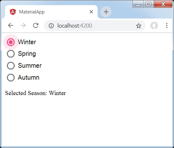
详细信息
首先,我们使用与 ngModel 绑定的 mat-radio-group 创建了一个单选按钮组。
然后,我们使用 mat-radio-button 添加了单选按钮。

