
Angular Material 7 - 滑块
<mat-slider> 是一个 Angular 指令,用作具有材料设计样式和动画功能的增强范围选择器。
在本章中,我们将展示使用 Angular Material 绘制滑块控件所需的配置。
创建 Angular 应用程序
按照以下步骤更新我们在Angular 6 - 项目设置章节中创建的 Angular 应用程序 −
| 步骤 | 说明 |
|---|---|
| 1 | 创建一个名为 materialApp 的项目,如Angular 6 - 项目设置章节中所述。 |
| 2 | 修改 app.module.ts, app.component.ts, app.component.css 和 app.component.html,如下所述。 保持其余文件不变。 |
| 3 | 编译并运行应用程序以验证实现逻辑的结果。 |
以下是修改后的模块描述符app.module.ts的内容。
import { BrowserModule } from '@angular/platform-browser';
import { NgModule } from '@angular/core';
import { AppComponent } from './app.component';
import {BrowserAnimationsModule} from '@angular/platform-browser/animations';
import {MatSliderModule, MatCheckboxModule} from '@angular/material'
import {FormsModule, ReactiveFormsModule} from '@angular/forms';
@NgModule({
   declarations: [
      AppComponent
   ],
   imports: [
      BrowserModule,
      BrowserAnimationsModule,
      MatSliderModule, MatCheckboxModule,
      FormsModule,
      ReactiveFormsModule
   ],
   providers: [],
   bootstrap: [AppComponent]
})
export class AppModule { }
以下是修改后的HTML主机文件app.component.html的内容。
<mat-slider
   class = "tp-margin"
   [disabled] = "disabled"
   [invert] = "invert"
   [thumbLabel] = "thumbLabel"
   [(ngModel)] = "value"
   [vertical] = "vertical">
</mat-slider>
<section class = "tp-section">
   <mat-checkbox class = "tp-margin" [(ngModel)] = "thumbLabel">Show thumb label</mat-checkbox>
</section>
<section class = "tp-section">
   <mat-checkbox class = "tp-margin" [(ngModel)] = "vertical">Vertical</mat-checkbox>
   <mat-checkbox class = "tp-margin" [(ngModel)] = "invert">Inverted</mat-checkbox>
</section>
<section class = "tp-section">
   <mat-checkbox class = "tp-margin" [(ngModel)] = "disabled">Disabled</mat-checkbox>
</section>
以下是修改后的CSS文件app.component.css的内容。
.tp-section {
   display: flex;
   align-content: center;
   align-items: center;
   height: 60px;
}
.tp-margin {
   margin: 30px;
}

.mat-slider-horizontal {
   width: 300px;
}
.mat-slider-vertical {
   height: 300px;
}
以下是修改后的ts文件app.component.ts的内容。
import { Component } from '@angular/core';
@Component({
   selector: 'app-root',
   templateUrl: './app.component.html',
   styleUrls: ['./app.component.css']
})
export class AppComponent {
   title = 'materialApp';
   disabled = false;
   invert = false;
   thumbLabel = false;
   value = 0;
   vertical = false;
}
结果
验证结果。
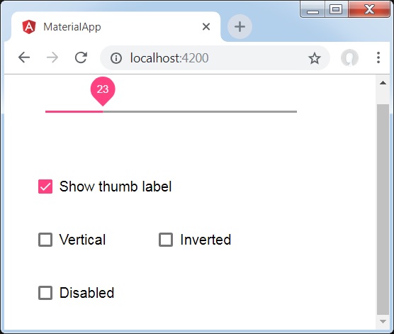
详细信息
首先,我们使用 mat-checkbox 创建了四个复选框,并使用 ngModel 和变量将它们绑定。 这些属性将用于自定义滑块。
然后,我们创建了滑块并展示了其与 .ts 文件中的变量绑定的各种属性。

