如何在 Matplotlib 中更改带有日期时间的 X 轴的范围?
matplotlibserver side programmingprogramming更新于 2025/4/30 14:52:17
要在 matplotlib 中更改带有日期时间的 X 轴的范围,我们可以采取以下步骤 −
创建一个 x 和 y 的列表,其中 x 存储日期时间,y 存储数字。
使用 subplots 方法创建一个图形并添加一组子图。
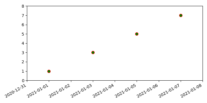
使用 plots() 方法绘制 x 和 y 数据点,其中标记面颜色为绿色,标记边缘颜色为红色,标记大小为7.
由于日期刻度标签经常重叠,因此使用 autofmt_xdate() 方法旋转它们并右对齐它们很有用。
要更改带有日期时间的 X 轴的范围,请使用带有日期时间范围的 set_xlim()。
要更改 Y 轴的范围,请使用 set_ylim() 方法。
要显示图形,请使用 show() 方法。
示例
import datetime
import matplotlib.pyplot as plt
plt.rcParams["figure.figsize"] = [7.00, 3.50]
plt.rcParams["figure.autolayout"] = True
x = [datetime.date(2021, 1, 1), datetime.date(2021, 1, 3), datetime.date(2021, 1,
5), datetime.date(2021, 1, 7)]
y = [1, 3, 5, 7]
fig, ax = plt.subplots()
ax.plot_date(x, y, markerfacecolor='green', markeredgecolor='red', ms=7)
fig.autofmt_xdate()
ax.set_xlim([datetime.date(2020, 12, 31), datetime.date(2021, 1, 8)])
ax.set_ylim([0, 8])
plt.show()
输出