
如何在 Python 中向图表添加图例?
简介...
图表的主要目的是使数据更容易理解。"一图胜千言"意味着无法用文字表达的复杂思想可以通过单个图像/图表传达。
在绘制包含大量信息的图表时,图例可能有助于显示相关信息,从而提高对所呈现数据的理解。
如何做到这一点..
在 matplotlib 中,图例可以以多种方式呈现。用于引起对特定点注意的注释也有助于帮助读者理解图表上显示的信息。
1. 通过打开 python 命令提示符并触发 pip install matplotlib 来安装 matplotlib。
2. 准备要显示的数据。
示例
import matplotlib.pyplot as plt

# 数据准备(我编造了这些统计数据中不准确的数据)
mobile = ['Iphone','Galaxy','Pixel']

# 以 400 万为单位售出的移动设备的数据
units_sold = (('2016',12,8,6),
('2017',14,10,7),
('2018',16,12,8),
('2019',18,14,10),
('2020',20,16,5),)
3. 将数据拆分为每家公司移动部门的数组。
示例
# 数据准备 - 拆分数据
IPhone_Sales = [Iphones for Year, Iphones, Galaxy, Pixel in unit_sold]
Galaxy_Sales = [Galaxy for Year, Iphones, Galaxy, Pixel in unit_sold]
Pixel_Sales = [Pixel for Year, Iphones, Galaxy, Pixel in unit_sold]

# 数据准备 - 标签
Years = [Year for Year, Iphones, Galaxy,Pixel in unit_sold]

# 设置位置
Position = list(range(len(units_sold)))

# 设置宽度
Width = 0.2
4. 使用准备好的数据创建条形图。每个产品销售都会调用 .bar,指定其位置和销售额。
使用 xy 和 xytext 属性添加注释。查看数据,Google Pixel 手机销量下降了 50%,即从 2019 年售出的 1000 万台下降到 2022 年的 500 万台。所以我们将把文本和注释设置为最后一个条形图。
最后,我们将使用 legend 参数添加图例。默认情况下,matplotlib 会在数据重叠最少的区域上绘制图例。
示例
plt.bar([p - Width for p in Position], IPhone_Sales, width=Width,color='green')
plt.bar([p for p in Position], Galaxy_Sales , width=Width,color='blue')
plt.bar([p + Width for p in Position], Pixel_Sales, width=Width,color='yellow')
# 将 X 轴设置为年份
plt.xticks(Position, Years)
# 设置 Y 轴标签
plt.xlabel('Yearly Sales')
plt.ylabel('Unit Sales In Millions')
# 设置注释 使用 xy 和 xytext 更改箭头
plt.annotate('50% Drop in Sales', xy=(4.2, 5), xytext=(5.0, 12),
horizontalalignment='center',
arrowprops=dict(facecolor='red', shrink=0.05))
# 设置图例
plt.legend(mobile, title='Manufacturers')
输出
<matplotlib.legend.Legend at 0x19826618400>
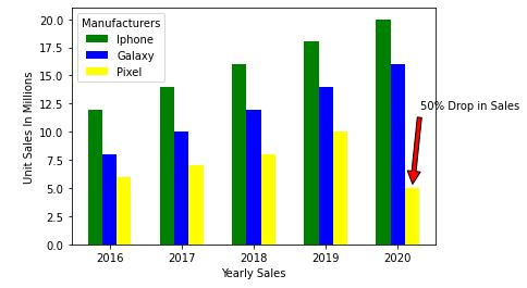
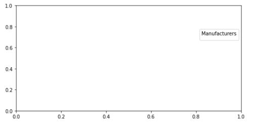
如果您觉得在图表内添加图例会造成噪音,可以使用 bbox_to_anchor 选项在外面绘制图例。 bbox_to_anchor 具有 (X, Y) 位置,其中 0 表示图形的左下角,1 表示右上角。
注意: - 使用 .subplots_adjust 调整图形开始和结束的图例。
例如,right=0.50 值表示将屏幕的 50% 留在图的右侧。左侧的默认值为 0.125,这意味着它在左侧留下了 12.5% 的空间。
输出
plt.legend(mobile, title='Manufacturers', bbox_to_anchor=(1, 0.8))
plt.subplots_adjust(right=1.2)
示例
6.最后让我们保存该图形。
import matplotlib.pyplot as plt
# 数据准备(我编造了这些统计数据中不准确的数据)
mobile = ['Iphone','Galaxy','Pixel']
# 4 个季度内售出的移动设备数据(百万)
units_sold = (('2016',12,8,6),
('2017',14,10,7),
('2018',16,12,8),
('2019',18,14,10),
('2020',20,16,5),)
# 数据准备 - 拆分数据
IPhone_Sales = [Iphones for Year, Iphones、Galaxy、Pixel in unit_sold]
Galaxy_Sales = [Galaxy for Year、Iphones、Galaxy、Pixel in unit_sold]
Pixel_Sales = [Pixel for Year、Iphones、Galaxy、Pixel in unit_sold]
# 数据准备 - 标签
Years = [Year for Year、Iphones、Galaxy、Pixel in unit_sold]
# 设置位置
Position = list(range(len(units_sold)))
# 设置宽度
Width = 0.2
plt.bar([p - Width for p in Position], IPhone_Sales, width=Width,color='green')
plt.bar([p for p in Position], Galaxy_Sales , width=Width,color='blue')
plt.bar([p + Width for p in Position], Pixel_Sales, width=Width,color='yellow')
# 将 X 轴设置为年份
plt.xticks(Position, Years)
# 设置 Y 轴标签
plt.xlabel('Yearly Sales')
plt.ylabel('Unit Sales In Millions')
# 设置注释 使用 xy 和 xytext 更改箭头
plt.annotate('50% Drop in Sales', xy=(4.2, 5), xytext=(5.0, 12),
horizontalalignment='center',
arrowprops=dict(facecolor='red', shrink=0.05))
# 设置图例
plt.legend(mobile, title='Manufacturers')
plt.legend(mobile, title='Manufacturers')
plt.subplots_adjust(right=1.2)
# plt.show()
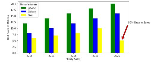
plt.savefig('MobileSales.png')
相关文章
有用资源
python 参考教程 - 该教程包含有关 python 的更多信息:https://www.cainiaomax.com/python/

