在 Matplotlib 中绘制回归图和残差图
machine learningserver side programmingprogrammingmatplotlib更新于 2025/8/31 17:07:17
为了在给定变量的联合分布的观测值之间建立简单的关系,我们可以使用 Seaborn 创建回归模型的图。
为了使用回归模型拟合数据集,我们必须首先导入必要的 Python 库。
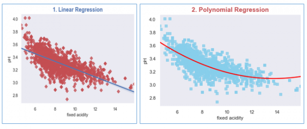
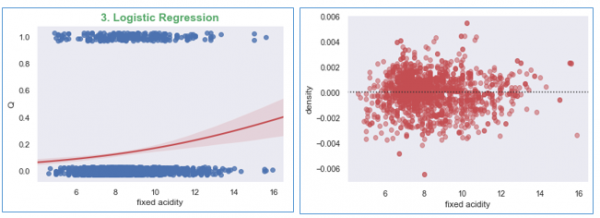
我们将为每个回归模型创建图:(a) 线性回归,(b) 多项式回归,以及 (c) 逻辑回归。
在本例中,我们将使用 wine quality dataset,您可以从此处访问:https://archive.ics.uci.edu/ml/datasets/wine+quality
示例
import matplotlib.pyplot as plt
import seaborn as sns
from scipy.stats import pearsonr
sns.set(style="dark", color_codes=True)

#import the dataset
wine_quality = pd.read_csv('winequality-red.csv', delimiter=';')

#Plotting Linear Regression
R, p = pearsonr(wine_quality['fixed acidity'], wine_quality.pH)
g1 = sns.regplot(x='fixed acidity', y='pH', data=wine_quality, truncate=True, ci=99,
marker='D', scatter_kws={'color': 'r'});
textstr = '$\mathrm{pearson}\hspace{0.5}\mathrm{R}^2=%.2f$
$\mathrm{pval}=%.2e$ '% (R**2, p)
props = dict(boxstyle='round', facecolor='wheat', alpha=0.5)
g1.text(0.55, 0.95, textstr, fontsize=14, va='top', bbox=props)
plt.title('1. Linear Regression', size=15, color='b', weight='bold')

#Let us Plot the Polynomial Regression plot for the wine dataset
g2 = sns.regplot(x='fixed acidity', y='pH', data=wine_quality, order=2, ci=None,
   marker='s', scatter_kws={'color': 'skyblue'},
   line_kws={'color': 'red'});
plt.title('2. Polynomial Regression', size=15, color='r', weight='bold')

#Now plotting the Logistic Regression
wine_quality['Q'] = wine_quality['quality'].map({'Low': 0, 'Med': 0, 'High':1})
g2 = sns.regplot(x='fixed acidity', y='Q', logistic=True,
   n_boot=750, y_jitter=.03, data=wine_quality,
   line_kws={'color': 'r'})
plt.show();

#Now plot the residual plot
g3 = sns.residplot(x='fixed acidity', y='density', order=2,
   data=wine_quality, scatter_kws={'color': 'r',
   'alpha': 0.5});
plt.show();
运行上述代码将生成如下输出,
输出