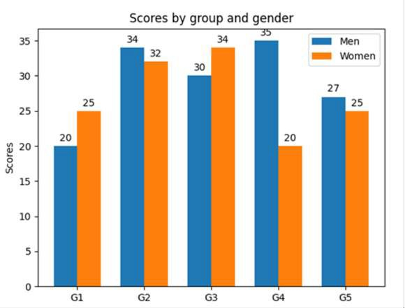
Python matplotlib 多条形图
matplotlibserver side programmingprogramming更新于 2025/8/30 18:07:17
我们可以使用用户自定义方法 autolabel 来标注轴值。在此之前,我们可以使用 plt.subplots() 方法初始化 fig 和 ax。
步骤
创建包含不同数据元素的列表、标签、men_means 和 women_means。
使用 numpy.arrange() 方法返回给定间隔内等距的值。
设置 width 变量,例如 width=0.35。
使用 subplots 方法创建 fig 和 ax 变量,其中默认的 nrows 和 ncols 为 1。
条形图以给定的 *align* 位置定位在 *x* 处。它们的尺寸由*高度*和*宽度*给出。垂直基线为*底部*(默认值为 0),因此使用 plt.bar() 方法创建 rect1 和 rect2。
使用 plt.ylabel() 方法设置 Y 轴标签。
使用 set_title() 方法设置坐标轴的标题。
使用 set_xticks() 方法获取或设置 X 轴的当前刻度位置和标签。
使用 set_xticklabels() 方法设置网格的 x 轴刻度标签。
使用 legend() 方法在图形上放置图例。
使用 autolabel() 方法(用户定义的方法)为创建的条形图(rect1 和 rect2)添加标签注释。
要显示图形,请使用 plt.show() 方法。
示例
import matplotlib.pyplot as plt
import numpy as np

labels = ['G1', 'G2', 'G3', 'G4', 'G5']
men_means = [20, 34, 30, 35, 27]
women_means = [25, 32, 34, 20, 25]

x = np.arange(len(labels))
width = 0.35

fig, ax = plt.subplots()
rects1 = ax.bar(x - width / 2, men_means, width, label='Men')
rects2 = ax.bar(x + width / 2, women_means, width, label='Women')

ax.set_ylabel('Scores')
ax.set_title('Scores by group and gender')
ax.set_xticks(x)
ax.set_xticklabels(labels)
ax.legend()

def autolabel(rects):
   for rect in rects:
      height = rect.get_height()
      ax.annotate('{}'.format(height),
         xy=(rect.get_x() + rect.get_width() / 2, height),
         xytext=(0, 3), # 3 points vertical offset
         textcoords="offset points",
         ha='center', va='bottom')

autolabel(rects1)
autolabel(rects2)

plt.show()
输出