Ngx-Bootstrap - Modals
ngx-bootstrap 模态组件是一个灵活且高度可配置的对话框提示,提供多个默认值,可以使用最少的代码。
ModalDirective
选择器
[bsModal]
输入
config − ModalOptions,允许通过元素属性设置模态配置
输出
onHidden −当模态框对用户完全隐藏时(将等待 CSS 转换完成),将触发此事件。
onHide − 调用 hide 实例方法后,将立即触发此事件。
onShow − 调用 show 实例方法后,将立即触发此事件。
onShown − 当模态框对用户可见时(将等待 CSS 转换完成),将触发此事件。
方法
show() − 允许手动打开模态框。
hide() −允许手动关闭模态框。
toggle() − 允许手动切换模态框可见性。
showElement() − 显示对话框。
focusOtherModal() − 事件技巧。
示例
由于我们要使用模态框,因此我们必须更新 ngx-bootstrap Dropdowns 一章中使用的 app.module.ts,以使用 ModalModule 和 BsModalService。
更新 app.module.ts,以使用 ModalModule 和 BsModalService。
app.module.ts
import { BrowserModule } from '@angular/platform-browser';
import { NgModule } from '@angular/core';
import { BrowserAnimationsModule } from '@angular/platform-browser/animations';
import { AppComponent } from './app.component';
import { TestComponent } from './test/test.component';
import { AccordionModule } from 'ngx-bootstrap/accordion';
import { AlertModule,AlertConfig } from 'ngx-bootstrap/alert';
import { ButtonsModule } from 'ngx-bootstrap/buttons';
import { FormsModule } from '@angular/forms';
import { CarouselModule } from 'ngx-bootstrap/carousel';
import { CollapseModule } from 'ngx-bootstrap/collapse';
import { BsDatepickerModule, BsDatepickerConfig } from 'ngx-bootstrap/datepicker';
import { BsDropdownModule,BsDropdownConfig } from 'ngx-bootstrap/dropdown';
import { ModalModule, BsModalService } from 'ngx-bootstrap/modal';

@NgModule({
   declarations: [
      AppComponent,
      TestComponent
   ],
   imports: [
      BrowserAnimationsModule,
      BrowserModule,
      AccordionModule,
      AlertModule,
      ButtonsModule,
      FormsModule,
      CarouselModule,
      CollapseModule,
      BsDatepickerModule.forRoot(),
      BsDropdownModule,
      ModalModule
   ],
   providers: [AlertConfig, BsDatepickerConfig, BsDropdownConfig,BsModalService],
   bootstrap: [AppComponent]
})
export class AppModule { }
更新 test.component.html 以使用模式。
test.component.html
<button type="button" class="btn btn-primary" (click)="openModal(template)">Open modal</button>

<ng-template #template>
   <div class="modal-header">
      <h4 class="modal-title pull-left">Modal</h4>
      <button type="button" class="close pull-right" aria-label="Close" (click)="modalRef.hide()">
         <span aria-hidden="true">×</span>
      </button>
   </div>
   <div class="modal-body">
      This is a sample modal dialog box.
   </div>
   <div class="modal-footer">
      <button type="button" class="btn btn-default" (click)="modalRef.hide()">Close</button>
   </div>
</ng-template>
更新 test.component.ts 以获取相应的变量和方法。
test.component.ts
import { Component, OnInit, TemplateRef } from '@angular/core';
import { BsModalRef, BsModalService } from 'ngx-bootstrap/modal';

@Component({
   selector: 'app-test',
   templateUrl: './test.component.html',
   styleUrls: ['./test.component.css']
})
export class TestComponent implements OnInit {

   modalRef: BsModalRef;
   constructor(private modalService: BsModalService) {}

   openModal(template: TemplateRef<any>) {
      this.modalRef = this.modalService.show(template);
   }

   ngOnInit(): void {
   }
}
构建和服务
运行以下命令启动 angular 服务器。
ng serve
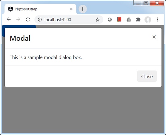
服务器启动并运行后。打开 http://localhost:4200。单击"打开模式"按钮并验证以下输出。