如何在 Matplotlib 图中插入统计注释(星号或 p 值)?
matplotlibserver side programmingprogramming更新于 2025/4/29 7:52:17
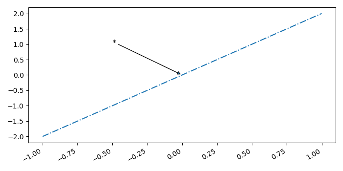
要插入统计注释,我们可以采取以下步骤 −
创建数字列表(x 和 y)。
使用 subplots() 方法创建一个图形和一组子图。
使用 plot() 方法,绘制包含日期的数据,线型为"-"。
使用 annotate() 方法注释图中的点,x 和 y 的平均值。
要显示图形,请使用 show() 方法。
示例
import numpy as np
from matplotlib import pyplot as plt
plt.rcParams["figure.figsize"] = [7.00, 3.50]
plt.rcParams["figure.autolayout"] = True
x = np.linspace(-1, 1, 5)
y = np.linspace(-2, 2, 5)
mean_x = np.mean(x)
mean_y = np.mean(y)
fig, ax = plt.subplots()
ax.plot(x, y, linestyle='-.')
ax.annotate('*', (mean_y, mean_y), xytext=(-.50, 1), arrowprops=dict(arrowstyle='-|>'))
fig.autofmt_xdate()
plt.show()
输出