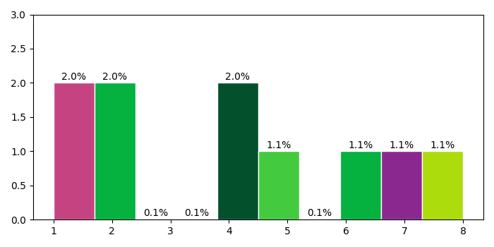
在 Matplotlib 中绘制 Y 轴百分比直方图
matplotlibserver side programmingprogramming更新于 2025/8/26 8:07:17
要在 Matplotlib 中绘制 Y 轴百分比直方图,我们可以执行以下步骤 −
创建一个数字列表 y。
创建多个 bin。
使用 hist() 方法绘制直方图,其中 y、bins 和 edgecolor 参数作为参数。存储色块以设置 Y 轴的百分比。
根据给定的字母数字创建一个颜色列表。
要设置百分比,请迭代色块(在步骤 3 中获得)。
设置 Y 轴刻度范围。
要显示图形,请使用 show() 方法。
示例
import random
import numpy as np
from matplotlib import pyplot as plt
plt.rcParams["figure.figsize"] = [7.00, 3.50]
plt.rcParams["figure.autolayout"] = True
y = [4, 1, 8, 7, 6, 4, 2, 1, 2, 5]
nbins = 10
_, _, patches = plt.hist(y, bins=nbins, edgecolor='white')
colors = ["#" + ''.join([random.choice('0123456789ABCDEF') for j in range(6)])
for i in range(nbins)]
for patch in patches:
   patch.set_facecolor(colors[np.random.randint(100) % nbins])
   x = patch.get_x() + patch.get_width() / 2
   y = patch.get_height() + .05
   plt.annotate('{:.1f}%'.format(y), (x, y), ha='center')
plt.ylim(0, 3)
plt.show()
输出