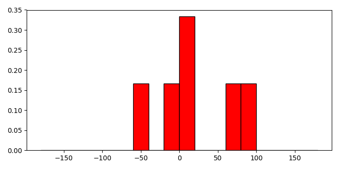
在 Matplotlib 直方图中设置相对频率
matplotlibserver side programmingprogramming更新于 2025/9/12 2:52:17
要在 Matplotlib 直方图中设置相对频率,我们可以采取以下步骤 −
创建一个包含数据和箱位的数字列表。
使用 histogram() 方法计算一组数据的直方图。
从直方图中获取直方图和边。
计算直方图的频率。
使用箱位(步骤 1)和频率数据(步骤 4)制作条形图。
要显示图形,请使用 show() 方法。
示例
import numpy as np
from matplotlib import pyplot as plt
plt.rcParams["figure.figsize"] = [7.00, 3.50]
plt.rcParams["figure.autolayout"] = True
a = [-0.125, .15, 8.75, 72.5, -44.245, 88.45]
bins = np.arange(-180, 181, 20)
hist, edges = np.histogram(a, bins)
freq = hist/float(hist.sum())
plt.bar(bins[:-1], freq, width=20, align="edge", ec="k", color='red')
plt.show()
输出