
React Native - 按钮
在本章中,我们将向您展示 React Native 中的可触摸组件。我们称它们为"可触摸",因为它们提供内置动画,我们可以使用 onPress prop 来处理触摸事件。
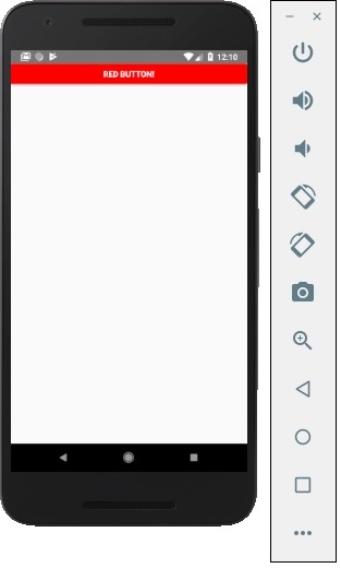
Facebook 提供了 Button 组件,可用作通用按钮。请考虑以下示例以了解相同内容。
App.js
import React, { Component } from 'react'
import { Button } from 'react-native'

const App = () => {
   const handlePress = () => false
   return (
      <Button
         onPress = {handlePress}
         title = "Red button!"
         color = "red"
      />
   )
}
export default App
如果默认的 Button 组件不符合您的需求,您可以使用以下组件之一代替。
可触摸不透明度
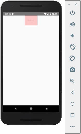
此元素在触摸时会改变元素的不透明度。
App.js
import React from 'react'
import { TouchableOpacity, StyleSheet, View, Text } from 'react-native'

const App = () => {
   return (
      <View style = {styles.container}>
         <TouchableOpacity>
            <Text style = {styles.text}>
               Button
            </Text>
         </TouchableOpacity>
      </View>
   )
}
export default App

const styles = StyleSheet.create ({
   container: {
      alignItems: 'center',
   },
   text: {
      borderWidth: 1,
      padding: 25,
      borderColor: 'black',
      backgroundColor: 'red'
   }
})
可触摸突出显示
当用户按下元素时,它会变暗,底层颜色会显示出来。
App.js
import React from 'react'
import { View, TouchableHighlight, Text, StyleSheet } from 'react-native'

const App = (props) => {
   return (
      <View style = {styles.container}>
         <TouchableHighlight>
            <Text style = {styles.text}>
               Button
            </Text>
         </TouchableHighlight>
      </View>
   )
}
export default App

const styles = StyleSheet.create ({
   container: {
      alignItems: 'center',
   },
   text: {
      borderWidth: 1,
      padding: 25,
      borderColor: 'black',
      backgroundColor: 'red'
   }
})
可触摸的原生反馈
这将在按下元素时模拟墨水动画。
App.js
import React from 'react'
import { View, TouchableNativeFeedback, Text, StyleSheet } from 'react-native'

const Home = (props) => {
   return (
      <View style = {styles.container}>
         <TouchableNativeFeedback>
            <Text style = {styles.text}>
               Button
            </Text>
         </TouchableNativeFeedback>
      </View>
   )
}
export default Home

const styles = StyleSheet.create ({
   container: {
      alignItems: 'center',
   },
   text: {
      borderWidth: 1,
      padding: 25,
      borderColor: 'black',
      backgroundColor: 'red'
   }
})
无反馈触摸
当您想要处理无任何动画的触摸事件时,应使用此组件。通常,此组件用得不多。
<TouchableWithoutFeedback>
   <Text>
      Button
   </Text>
</TouchableWithoutFeedback>

