React Native - 模态
在本章中,我们将向您展示如何在 React Native 中使用模态组件。
现在让我们创建一个新文件:ModalExample.js
我们将逻辑放入 ModalExample 中。我们可以通过运行 toggleModal 来更新初始状态。
通过运行 toggleModal 更新初始状态后,我们将为模态设置 visible 属性。当状态改变时,此属性将被更新。
Android 设备需要 onRequestClose。
App.js
import React, { Component } from 'react'
import WebViewExample from './modal_example.js'

const Home = () => {
   return (
      <WebViewExample/>
   )
}
export default Home;
modal_example.js
import React, { Component } from 'react';
import { Modal, Text, TouchableHighlight, View, StyleSheet}

from 'react-native'
class ModalExample extends Component {
   state = {
      modalVisible: false,
   }
   toggleModal(visible) {
      this.setState({ modalVisible: visible });
   }
   render() {
      return (
         <View style = {styles.container}>
            <Modal animationType = {"slide"} transparent = {false}
               visible = {this.state.modalVisible}
               onRequestClose = {() => { console.log("Modal has been closed.") } }>

               <View style = {styles.modal}>
                  <Text style = {styles.text}>Modal is open!</Text>

                  <TouchableHighlight onPress = {() => {
                     this.toggleModal(!this.state.modalVisible)}}>

                     <Text style = {styles.text}>Close Modal</Text>
                  </TouchableHighlight>
               </View>
            </Modal>

            <TouchableHighlight onPress = {() => {this.toggleModal(true)}}>
               <Text style = {styles.text}>Open Modal</Text>
            </TouchableHighlight>
         </View>
      )
   }
}
export default ModalExample

const styles = StyleSheet.create ({
   container: {
      alignItems: 'center',
      backgroundColor: '#ede3f2',
      padding: 100
   },
   modal: {
      flex: 1,
      alignItems: 'center',
      backgroundColor: '#f7021a',
      padding: 100
   },
   text: {
      color: '#3f2949',
      marginTop: 10
   }
})
我们的起始屏幕将如下所示 −
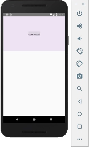
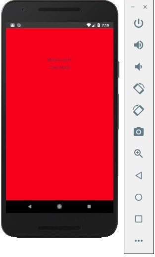
如果我们单击按钮,模态框将打开。